


Factors To Consider When Choosing a Website Development Company For Your eStore
 Team Branex
The year was 1980. There was a grand party at the headquarters of Crest toothpaste. The COO suggested that due to a knowledge-intensive environment, a new strategy must be devised. After a thorough brainstorming session, it was concluded that introducing new variations of the toothpaste would do good for the website development company. The suggestion was well-received within the organization and month 52 varieties of Crest toothpaste hit the shelves of the major supermarkets.
Unfortunately, when Crest was working on its 52 variants, Colgate launched ‘Colgate Total’. Just a single toothpaste that can clean the teeth and brighten your smile.
Now, whenever the customer visits a store, they had two choices. Either they can choose from one Colgate, or they can choose from 52 variants of Crest.
Let’s imagine the internal dialogue of the customer:
‘There are so many variations of Crest.
Wow! They care so much. Wait, what? Do they have 52 variations? Are you kidding me?
I don’t have the time to go through a ton of options; I just need one toothpaste that will do the job.
Hmmm… Colgate seems to be okay for me.’
When presented with many choices, human beings tend to get confused.
If you own a business or are planning to start one, you must first have a website. Now, you can either use internal resources or find someone who’s in the business of developing websites. There are more than 60,000 website development agencies out there in the U.S. This ginormous number makes it a near-impossible task to choose the right one.
But why worry when you’ve got us?
Allow us to take this burden off your shoulders.
Here are some vital tips that you must consider before handling your website development job at a new agency.
 Unless you’ve got a fortune stashed somewhere, you must look at the available resources in your firm.
Developing an eCommerce website demands serious skills.
Design sense, what type of content needs to go on the website, UI/UX design and development, testing, quality control, deciding on which eCommerce software platform to use, search engine optimization, and so on.
If you or your team have the aforementioned non-exhaustive list of skills, then that would help you get your website launched quickly and also reduce the burden on your company’s wallet.
However, most new and even established eCommerce stores often don’t have the required resources or time to develop their website. And that’s when getting a professional website developer on the board becomes imperative for a successful website launch.
Now, that you’re all set, here are the factors that you must consider before hiring a professional website development agency for your eCommerce store.
Unless you’ve got a fortune stashed somewhere, you must look at the available resources in your firm.
Developing an eCommerce website demands serious skills.
Design sense, what type of content needs to go on the website, UI/UX design and development, testing, quality control, deciding on which eCommerce software platform to use, search engine optimization, and so on.
If you or your team have the aforementioned non-exhaustive list of skills, then that would help you get your website launched quickly and also reduce the burden on your company’s wallet.
However, most new and even established eCommerce stores often don’t have the required resources or time to develop their website. And that’s when getting a professional website developer on the board becomes imperative for a successful website launch.
Now, that you’re all set, here are the factors that you must consider before hiring a professional website development agency for your eCommerce store.
 If there’s no harm in asking for extra ketchup at McDonald's. And no shame in asking for an extra pair of napkins at your favorite restaurant. Then why do people feel shy in asking for a portfolio?
A website is the backbone of your company where your customers will come to purchase your products. The first impression of your customer in terms of UI and UX.
Do you want to leave everything in the hands of a website agency with no confusing portfolio? I don’t think so.
Ask them about their ongoing and finished eCommerce website projects. Also, learn as much as possible regarding their previous customers' work.
Doing a background check along with evaluating the developers’ portfolio will help you ascertain whether they are capable enough to work on your website and make it successful.
If there’s no harm in asking for extra ketchup at McDonald's. And no shame in asking for an extra pair of napkins at your favorite restaurant. Then why do people feel shy in asking for a portfolio?
A website is the backbone of your company where your customers will come to purchase your products. The first impression of your customer in terms of UI and UX.
Do you want to leave everything in the hands of a website agency with no confusing portfolio? I don’t think so.
Ask them about their ongoing and finished eCommerce website projects. Also, learn as much as possible regarding their previous customers' work.
Doing a background check along with evaluating the developers’ portfolio will help you ascertain whether they are capable enough to work on your website and make it successful.
 This indicator can easily be judged in the first few meetings with the client. Check the portfolio and gauge the amount of time that the vendor invests in each project.
Ask about the challenges and the contingency plans that the web development company has in place in case of an emergency. If the company is experienced, they will be able to provide you with a clear-cut plan.
Based on their expertise, the vendor will be able to inform you how much time each phase will take and what will the next course of action if the deadline is not met. You can also mutually discuss how the vendor will be compensating you in case deadlines are missed.
This indicator can easily be judged in the first few meetings with the client. Check the portfolio and gauge the amount of time that the vendor invests in each project.
Ask about the challenges and the contingency plans that the web development company has in place in case of an emergency. If the company is experienced, they will be able to provide you with a clear-cut plan.
Based on their expertise, the vendor will be able to inform you how much time each phase will take and what will the next course of action if the deadline is not met. You can also mutually discuss how the vendor will be compensating you in case deadlines are missed.
 It is impossible to judge how efficient the developer is from the first meeting. However, after a few presales meetings, you can have a very clear picture of what levels of commitment and speed of delivery is the vendor going to demonstrate after you’ve hired them.
If the representatives of the agency are not addressing your request for more information quickly and they present unjustifiable reasons for the delay, then get ready for not only missed deadlines, but also unfulfilled commitments.
Cues such as the ones mentioned above are telltale signs that the person or the company you’re about to hire might not come up with the goods. Therefore, pay close attention to the way the developer deals with you in the first few interactions.
It is impossible to judge how efficient the developer is from the first meeting. However, after a few presales meetings, you can have a very clear picture of what levels of commitment and speed of delivery is the vendor going to demonstrate after you’ve hired them.
If the representatives of the agency are not addressing your request for more information quickly and they present unjustifiable reasons for the delay, then get ready for not only missed deadlines, but also unfulfilled commitments.
Cues such as the ones mentioned above are telltale signs that the person or the company you’re about to hire might not come up with the goods. Therefore, pay close attention to the way the developer deals with you in the first few interactions.
First, Take a Look At Your Resources
Unless you’ve got a fortune stashed somewhere, you must look at the available resources in your firm.
Developing an eCommerce website demands serious skills.
Design sense, what type of content needs to go on the website, UI/UX design and development, testing, quality control, deciding on which eCommerce software platform to use, search engine optimization, and so on.
If you or your team have the aforementioned non-exhaustive list of skills, then that would help you get your website launched quickly and also reduce the burden on your company’s wallet.
However, most new and even established eCommerce stores often don’t have the required resources or time to develop their website. And that’s when getting a professional website developer on the board becomes imperative for a successful website launch.
Now, that you’re all set, here are the factors that you must consider before hiring a professional website development agency for your eCommerce store.
Ask for the Portfolio
If there’s no harm in asking for extra ketchup at McDonald's. And no shame in asking for an extra pair of napkins at your favorite restaurant. Then why do people feel shy in asking for a portfolio?
A website is the backbone of your company where your customers will come to purchase your products. The first impression of your customer in terms of UI and UX.
Do you want to leave everything in the hands of a website agency with no confusing portfolio? I don’t think so.
Ask them about their ongoing and finished eCommerce website projects. Also, learn as much as possible regarding their previous customers' work.
Doing a background check along with evaluating the developers’ portfolio will help you ascertain whether they are capable enough to work on your website and make it successful.
Meeting the Deadlines
This indicator can easily be judged in the first few meetings with the client. Check the portfolio and gauge the amount of time that the vendor invests in each project.
Ask about the challenges and the contingency plans that the web development company has in place in case of an emergency. If the company is experienced, they will be able to provide you with a clear-cut plan.
Based on their expertise, the vendor will be able to inform you how much time each phase will take and what will the next course of action if the deadline is not met. You can also mutually discuss how the vendor will be compensating you in case deadlines are missed.
Response Time of the Agency
It is impossible to judge how efficient the developer is from the first meeting. However, after a few presales meetings, you can have a very clear picture of what levels of commitment and speed of delivery is the vendor going to demonstrate after you’ve hired them.
If the representatives of the agency are not addressing your request for more information quickly and they present unjustifiable reasons for the delay, then get ready for not only missed deadlines, but also unfulfilled commitments.
Cues such as the ones mentioned above are telltale signs that the person or the company you’re about to hire might not come up with the goods. Therefore, pay close attention to the way the developer deals with you in the first few interactions.


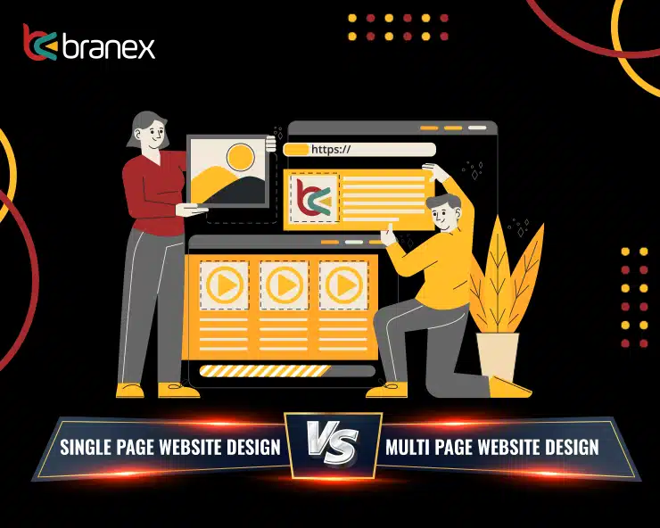
 A single-page website design is considered a pageless design. In this type of website design, the entire website content is summed up in a single page mapped on a
  On the other hand, a multi-page website design is quite the opposite of what a single-page website design is. In a multi-page website design, the content is widespread across a number of pages.
Such designs are best for big businesses and large organizations that offer a variety of services and are content-intensive. It is actually impossible to cram all the products and services on one page for such an organization unless you want to expose your audience to a lifetime of scrolling! Here, having a multiple-page website design is an understandable option.
Such website designs are proliferating across the Internet. Since these websites have been around for a while, they are more trusted by those who consider archetypal websites.
On the other hand, a multi-page website design is quite the opposite of what a single-page website design is. In a multi-page website design, the content is widespread across a number of pages.
Such designs are best for big businesses and large organizations that offer a variety of services and are content-intensive. It is actually impossible to cram all the products and services on one page for such an organization unless you want to expose your audience to a lifetime of scrolling! Here, having a multiple-page website design is an understandable option.
Such website designs are proliferating across the Internet. Since these websites have been around for a while, they are more trusted by those who consider archetypal websites.
 I hope this post helped you grasp the differences between single and multi-page design websites. To give you more clarity on which website pages are effective for what purpose, here is a small, valuable debrief. If your aim of launching a website is to narrow down the focus on incoming visitors and encourage them to perform a specified task, such as donating, subscribing, or purchasing, a single-page website is your savior. It is also a mobile-first design, which makes this type of website a source of better exposure.
However, if your website aims to represent an entire company that offers multiple services or a wide range of products to sell, a multi-page website design is a great option for your business. Multi-page website has an enormous potential to represent a brand, and it sticks to a traditional navigation system which is something truly great for your SEO strategy. However, there is no particular rule of thumb that dictates which website solution will work best when the purpose is to put your content in front of the audience.
Are you still not sure which is the most probable solution for you? Talk to us! Let us help you decide which design works best for your organization or business.
I hope this post helped you grasp the differences between single and multi-page design websites. To give you more clarity on which website pages are effective for what purpose, here is a small, valuable debrief. If your aim of launching a website is to narrow down the focus on incoming visitors and encourage them to perform a specified task, such as donating, subscribing, or purchasing, a single-page website is your savior. It is also a mobile-first design, which makes this type of website a source of better exposure.
However, if your website aims to represent an entire company that offers multiple services or a wide range of products to sell, a multi-page website design is a great option for your business. Multi-page website has an enormous potential to represent a brand, and it sticks to a traditional navigation system which is something truly great for your SEO strategy. However, there is no particular rule of thumb that dictates which website solution will work best when the purpose is to put your content in front of the audience.
Are you still not sure which is the most probable solution for you? Talk to us! Let us help you decide which design works best for your organization or business.
 You will notice the design is simple, clean, and free of any unnecessary graphics or content elements. They follow a color palette that truly depicts their brand style, and the content is short and to the point. In fact, everything is organized in an efficient manner and doesn't distract users from its real value and offerings. The CTA is clear and obvious, guiding users to take the action, “Sign up for Free.”
 When users visit their mobile website, they are provided with an option to search for a particular product or category. Etsy’s search bar uses an autofill feature to guess what the user is trying to search. Users also find attractive images of trending items in a collage format. Images are clear and big enough that can easily be tapped with the finger.
Etsy mobile website is a great example of easy and efficient site search functionality, making it easier for users to refine their search and browse the products they are searching for.
When users visit their mobile website, they are provided with an option to search for a particular product or category. Etsy’s search bar uses an autofill feature to guess what the user is trying to search. Users also find attractive images of trending items in a collage format. Images are clear and big enough that can easily be tapped with the finger.
Etsy mobile website is a great example of easy and efficient site search functionality, making it easier for users to refine their search and browse the products they are searching for.
 The mobile website design of Dove Men+Care focuses on minimal navigation, simple design, and
  Leans Labs’ mobile web design is a tremendous example of providing an out-of-the-box user experience. The mobile design smartly uses contrast and typefaces to highlight certain elements on the page. The subtle image of a mountain in the background truly depicts how the brands of Lean Labs customers can reach unprecedented heights of success. Their 10x formula is visible on the site and is clearly explained on their site.

 Do you still think that the pale yellow color in eBay is just a coincidence? Not at all. It is a well-thought-out strategy. The pale hue epitomizes contentment and warmth that match their current marketing strategy. And this is the very reason why General Motors leverages Blue, which denotes trust and reliability.
Before we dive into specific colors that draw attention, let us first look at culture, class, and gender differences that influence the buying decisions of your audience.
When it comes to culture, colors can have various connotations and cause problems for your website. For instance, in the East, white color is reserved for funerals, while if you move towards the West, white is the ultimate wedding color. In China, white represents death, while purple symbolizes death in Brazil.
A research revealed that in the United States, middle-class customers prefer colors that seem familiar, such as shades of Blue, Red, and Green. While the upper-tier and more refined echelon show a proclivity for products that incorporate glamorous colors such as taupe, azure, mauve, etc. For the same reason, Walmart’s logo is done up in bright red to serve as your everyday brand.
When we talk about gender, men display a predisposition for colors in shades of Blue and Green. While women prefer colors, that are variants of red and orange.
As a rule of thumb, countries with warm climates prefer warm colors such as red, yellow, and orange, while people from colder climates are more apt to choose cooler colors such as blue, green, and purple (violet).
Here are a few website color scheme references:
Do you still think that the pale yellow color in eBay is just a coincidence? Not at all. It is a well-thought-out strategy. The pale hue epitomizes contentment and warmth that match their current marketing strategy. And this is the very reason why General Motors leverages Blue, which denotes trust and reliability.
Before we dive into specific colors that draw attention, let us first look at culture, class, and gender differences that influence the buying decisions of your audience.
When it comes to culture, colors can have various connotations and cause problems for your website. For instance, in the East, white color is reserved for funerals, while if you move towards the West, white is the ultimate wedding color. In China, white represents death, while purple symbolizes death in Brazil.
A research revealed that in the United States, middle-class customers prefer colors that seem familiar, such as shades of Blue, Red, and Green. While the upper-tier and more refined echelon show a proclivity for products that incorporate glamorous colors such as taupe, azure, mauve, etc. For the same reason, Walmart’s logo is done up in bright red to serve as your everyday brand.
When we talk about gender, men display a predisposition for colors in shades of Blue and Green. While women prefer colors, that are variants of red and orange.
As a rule of thumb, countries with warm climates prefer warm colors such as red, yellow, and orange, while people from colder climates are more apt to choose cooler colors such as blue, green, and purple (violet).
Here are a few website color scheme references:
 If your store sells beauty products, the advised colors are pink, baby blue, and light green because most beauty products are targeted toward women.
For high prestige, products use Black, Silver, and Gold, just like in the automobile industry.
Brands with a health & eco-conscious focus gravitate towards greens, blues, and yellows.
If you choose colors because they are your favorite, you may have chosen them for the wrong target market. The website's color schemes are important, which is why colors are placed in such a way that you feel attracted to them.
We've all been subjected to sites with unpleasant color combinations. I have seen a few designs with colors chosen on the whim of the owner, and often they don’t paint a pretty picture; they are either very hard on the eyes (almost blinding) or make the text very difficult to read. You want people to view your website with ease. Remember, it's easy for your visitors to press the back button.
On the other hand, inducing a color vomit, or using the wrong combination of colors, could alienate or turn off your potential buyers completely. On average, you should only choose three colors (or shades of those colors) at most. You can even use various tones of colors across the entire website. The main goal is to keep the website's color schemes consistent throughout the whole website.
When it comes to selecting colors, trial and error is the key. You cannot know how your audience will respond to your colors until you test the waters. Just like when you test
If your store sells beauty products, the advised colors are pink, baby blue, and light green because most beauty products are targeted toward women.
For high prestige, products use Black, Silver, and Gold, just like in the automobile industry.
Brands with a health & eco-conscious focus gravitate towards greens, blues, and yellows.
If you choose colors because they are your favorite, you may have chosen them for the wrong target market. The website's color schemes are important, which is why colors are placed in such a way that you feel attracted to them.
We've all been subjected to sites with unpleasant color combinations. I have seen a few designs with colors chosen on the whim of the owner, and often they don’t paint a pretty picture; they are either very hard on the eyes (almost blinding) or make the text very difficult to read. You want people to view your website with ease. Remember, it's easy for your visitors to press the back button.
On the other hand, inducing a color vomit, or using the wrong combination of colors, could alienate or turn off your potential buyers completely. On average, you should only choose three colors (or shades of those colors) at most. You can even use various tones of colors across the entire website. The main goal is to keep the website's color schemes consistent throughout the whole website.
When it comes to selecting colors, trial and error is the key. You cannot know how your audience will respond to your colors until you test the waters. Just like when you test 

 Animations are a fun and interactive way to convince users to interact with an application or website. So, make your CTAs engaging to entice the interest of users.


 They did a fantastic job of including a lot of information in an organized manner. They include their physical address, phone number, and tour schedule, along with directions and parking instructions that customers might need when they visit the hall.
 Along with using a beautiful hero image, clearly displayed contact information, and an accessible contact form. The brand has smartly peppered in CTAs to persuade customers and make them feel valued.


 This results in no action being performed.
In light of this theory, it is essential to understand that most landing pages on the Internet fail to convert visitors just because they aren’t motivational or simple. Hence, the response to triggers turns into a complete failure.
You want important triggers, and we are here to help you get there. So, without any further ado, let’s delve in.
This results in no action being performed.
In light of this theory, it is essential to understand that most landing pages on the Internet fail to convert visitors just because they aren’t motivational or simple. Hence, the response to triggers turns into a complete failure.
You want important triggers, and we are here to help you get there. So, without any further ado, let’s delve in.
 Check out how QuickSprout nails it by using high-impact traffic conversion headlines portrayed in the form of an open-ended question. They readily convert a customer by using an actionable CTA such as “Grow my traffic” on a form, QuickSprout makes sure you sign up on their platform and become a part of their online venture.
 If you have associated your brand name with a bigger fish on the market, it’s time to cash that name for your business's benefit. Here’s how FreshBooks is using Forbes Magazine to empower customers! It just cashed the appraisal of “Incredibly User-Friendly,” which it earned from Forbes, and utilized it in their landing page headline.
 Lift your visitors' morale the same way Lyft is doing right now. If you ever get the chance to visit their official website, I am sure you won’t take much time to get convinced to sign up on their platform. Using a simple yet powerful “Grab the wheel and start earning” tagline is all it takes to compel users to hit that [Apply to Drive] CTA button.
Did you wonder what the common association is among all three above-mentioned headlines? Let’s look at it through the magnifying glass scope of Fogg’s behavior principle.
Lift your visitors' morale the same way Lyft is doing right now. If you ever get the chance to visit their official website, I am sure you won’t take much time to get convinced to sign up on their platform. Using a simple yet powerful “Grab the wheel and start earning” tagline is all it takes to compel users to hit that [Apply to Drive] CTA button.
Did you wonder what the common association is among all three above-mentioned headlines? Let’s look at it through the magnifying glass scope of Fogg’s behavior principle.
 Here, as you can see, the 1930s B.B. Korn Race Car in Red, which costs around $520, is a limited item with only 8 LEFT. On the other hand, Brass Accordion “Headlight” Sconce for $524.99 is all Sold Out. The idea is to empower the customer with the SOLD OUT option and motivate them to make a purchase for an item that’s on a limited sale. Even if you are not mentally prepared to make a purchase, but observing how effectively things are being sold out on the platform, you just might feel compelled to make that purchase.
Here’s another example of a website design which utilizes an urgency trigger to get you all hyped up so you end up making a purchase.
Here, as you can see, the 1930s B.B. Korn Race Car in Red, which costs around $520, is a limited item with only 8 LEFT. On the other hand, Brass Accordion “Headlight” Sconce for $524.99 is all Sold Out. The idea is to empower the customer with the SOLD OUT option and motivate them to make a purchase for an item that’s on a limited sale. Even if you are not mentally prepared to make a purchase, but observing how effectively things are being sold out on the platform, you just might feel compelled to make that purchase.
Here’s another example of a website design which utilizes an urgency trigger to get you all hyped up so you end up making a purchase.
 The bottom line is that scarcity motivates people to make a purchase because we hate to miss out on something which is trending on the market.
 At Tom’s, if you join their newsletter channel, they offer you a 10% discount. Even though the message is delivered through and through, I still believe that the secret of converting visitors into potential leads lies in the CTA “JOIN THE MOVEMENT” instead of the message communicated using the page design.
 Here’s another example where the website designer has used a “BUILD A MANPACK” with an interesting message as a part of the website design.
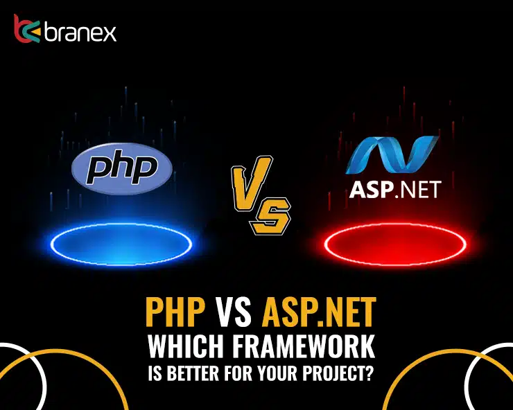
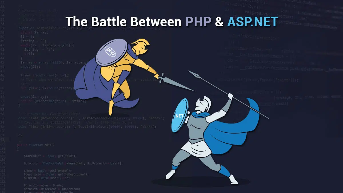 Before I start discussing the differences between the two. Let me make it clear that the final verdict will be from you. I am just laying down some facts for you to ponder.
One added advantage of PHP is that it is already deployed to more than 244 million websites across the globe.
Furthermore, PHP is that it is free of charge and the compilation is based upon various frameworks which provide ease to the website's development process.
WordPress & Facebook are two supreme examples of PHP and deliver a clear message on the potential of PHP.
As for ASP.NET, its advantage lies in the fact that the language is supported by Microsoft to comfort website developers.
The second best advantage of using ASP.NET is that you are using the .NET framework to code, which makes it easy for developers to code.
Now let me stop wasting your time and see in the battle between PHP vs ASP.NET, which one is better.
Before I start discussing the differences between the two. Let me make it clear that the final verdict will be from you. I am just laying down some facts for you to ponder.
One added advantage of PHP is that it is already deployed to more than 244 million websites across the globe.
Furthermore, PHP is that it is free of charge and the compilation is based upon various frameworks which provide ease to the website's development process.
WordPress & Facebook are two supreme examples of PHP and deliver a clear message on the potential of PHP.
As for ASP.NET, its advantage lies in the fact that the language is supported by Microsoft to comfort website developers.
The second best advantage of using ASP.NET is that you are using the .NET framework to code, which makes it easy for developers to code.
Now let me stop wasting your time and see in the battle between PHP vs ASP.NET, which one is better.
 The file system and the OS largely impact the overall performance of the application. On the other hand, the Linux Operating System offers a high-end I/O performance when we compare it to the Windows file system.
While PHP supports cross-platform and can be programmed on both Linux and Windows, ASP.NET is limited to one platform. However, with the recent update, ASP.NET Core and ASP.NET MVC now support multiple OS.
The file system and the OS largely impact the overall performance of the application. On the other hand, the Linux Operating System offers a high-end I/O performance when we compare it to the Windows file system.
While PHP supports cross-platform and can be programmed on both Linux and Windows, ASP.NET is limited to one platform. However, with the recent update, ASP.NET Core and ASP.NET MVC now support multiple OS.

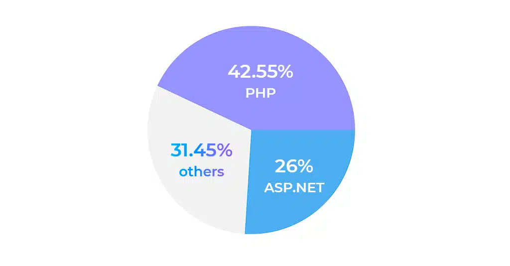 The statistics clearly show that in the battle between PHP vs ASP.NET. PHP is the favorite among website developers for several reasons, while ASP.NET is on a constant decline when it comes to popularity.
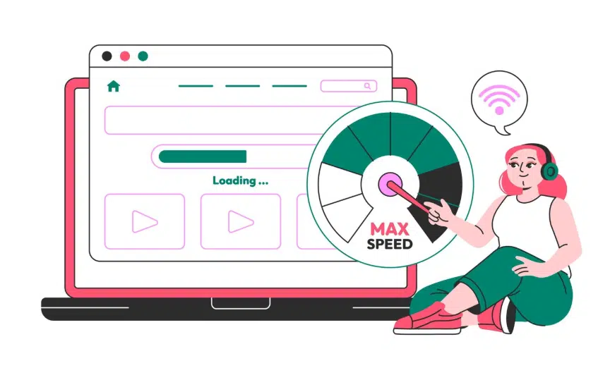 In contrast to various programming languages, PHP is seamless when it comes to hosting. To host PHP on any server and most of the popular servers are ready to host PHP.
If you’re planning to develop a website and are confused between PHP vs ASP.NET. You don’t need to worry about slow servers or anything quite simple without worrying about any hosting problems. PHP will keep up the speed without interfering with any other processes.
Also Read:
In contrast to various programming languages, PHP is seamless when it comes to hosting. To host PHP on any server and most of the popular servers are ready to host PHP.
If you’re planning to develop a website and are confused between PHP vs ASP.NET. You don’t need to worry about slow servers or anything quite simple without worrying about any hosting problems. PHP will keep up the speed without interfering with any other processes.
Also Read:  Unlike other programming languages, which include ASP.NET, program debugging is one issue which can bring tears to the eyes of the developers. With PHP, you can ask for help from the PHP community that is widely available on the internet.
Whenever you make a request to fix an issue in PHP. It will refresh and clear up to help you out. This means once the issue is raised, it will not interfere with any other issue, and work on your own phase.
Unlike other programming languages, which include ASP.NET, program debugging is one issue which can bring tears to the eyes of the developers. With PHP, you can ask for help from the PHP community that is widely available on the internet.
Whenever you make a request to fix an issue in PHP. It will refresh and clear up to help you out. This means once the issue is raised, it will not interfere with any other issue, and work on your own phase.

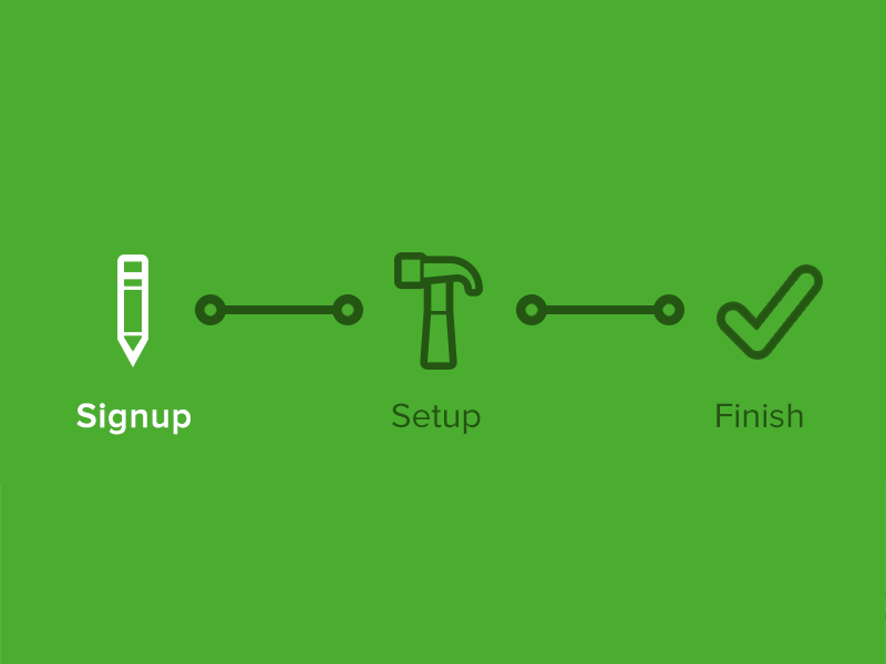
 Here are some essential tips and tricks that can help you better understand the process of building a lucrative e-commerce website from scratch.
Let’s dive in.
Here are some essential tips and tricks that can help you better understand the process of building a lucrative e-commerce website from scratch.
Let’s dive in.
