Minimalism in web design enhances functionality, improves load times, and makes content more accessible by removing unnecessary elements, allowing users to focus on key features. This approach fosters clarity and ease of navigation, which can have a maximalist effect by amplifying the site’s usability and overall aesthetic appeal, creating a bold and memorable impact.
Imagine your exasperation if someone takes you to a room as cluttered and screaming chaos as the one in the picture above us, and asks you to focus. Your immediate reaction would be, “What exactly should I focus on?”
The same goes for websites. Early in the first Jurassic Park film, the hipster, mumbly scientist, questions the creators of the park by saying, “Your scientists were so preoccupied with whether or not they could that they didn’t stop to think if they should.” Similarly, just because you have tinkled with your web design knowledge and know how to add bells and whistles to your website.
It doesn’t mean that your next web design project is the place to flaunt it all! A Website design is essentially like a room, where each one represents a business and sells a unique value proposition to its customers. However, a cluttered website design may distract the online visitor from the focal point and the theme of the site, and may as well confuse them, eventually compelling them to bounce off.
The core function of any website design is to create a great user experience which is achieved by creating aesthetically pleasing and functional websites. Too many elements that demand attention and divert the concentration of the users on any website design can wreak havoc on the achievement of a great user experience.
In fact, well within 50 milliseconds of exposure, visual complexity can have a huge impact on the user’s perception of the site, which is exactly why the world is now turning its focus towards a minimalistic approach to website design. As Antoine de Saint-Exupery, a French writer has said, “Perfection is achieved, not when there is nothing more to add, but when there is nothing left to take away.”
How Did the Minimalist Design Approach Come to Life?
Although minimalist design is a relatively new trend in website design, the idea has been in and around the industry for quite a long time. Decades before minimalism crawled its way into web design, it started off as a visual art movement in the wake of World War II. It popped up as a reaction to the marked subjectivity, motion, and chaotic colors often found in a plethora of abstract expressionist works.
In the 1960’s, minimalism had also snaked its tendrils into the fields of fine arts and architecture. Minimalism was characterized in visual art by industrial materials, serial arrangements, geometric elements, and monochromatic palettes.
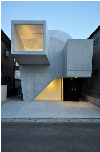
The depiction of its presence lies in a few of the global cultures that have used the minimalist approach in their architecture and societal planning. Cultures like the Japanese have valued simplicity and have used this technique in creating various forms of art and architecture for a long time and the influence can still be seen in the modern-day architecture within the country.
The influence of “less is more” dispersed to other cultures soon and was appreciated by enthusiasts who valued creativity. The focus-building capabilities of this movement allowed the minimalist design approach to cast its spell on the website design industry and was soon accepted as a leading trend in website creation.
The Minimalist Approach in Today’s Website Designs
The emergence of minimalism in modern-day website design and development doesn’t date back too long. However, the trend has seen significant growth and appreciation within the past few years of existence. The visual complexity of website designs has been adversely affecting the lead generation capabilities of the promising medium and is found to affect the user’s perception regarding the brand itself. Therefore, as a replenishment therapy for the website design, minimalism was approached to correct the areas where the errors occurred.
Minimalist design is design at its most basic; devoid of all superfluous textures, shapes, and color. Not only did minimalism help in bringing back the element of focus in the website designs, but it also catered to some of the elements that were attributed to the success of an online website. Faster loading, lighter weight, and better compatibility were to name a few.
Perhaps, one of the most prominent examples of minimalism is Google search. With fewer elements, Google has opted for simplicity in its web interface ever since it existed. You can see that their main search page was designed around a core functionality, eliminating any other distractions that could create complications.

Let’s take a closer look at the elements that help incorporate minimalism for greater-looking website designs:
Focus on the Essentials
To create a truly action-inducing interface, a website designer should only focus on the essential elements that are required to communicate the business message effectively. This can be achieved by putting a distinct focus on one bit of content, eliminating competition from surrounding elements, so that it basks in the limelight. Showing elements that are important for business development and stripping away the unnecessary baggage allow the website to breathe and the customers to easily go through the content without much ado. The main aim is to make the primary action, which is desired by the business, easily attainable through the website.

For instance, in the website above, the splash of bold color against a white background, one graphic element, and just one block of text is sure to draw the eye of the user. The graphic element introduces shape, texture, and color. Since it defines the designer’s identity and brand, it is the single most important thing on the page. Since this graphical element is already pretty complex, peppering in more content on this page would have rendered it less conspicuous. The designer struck the right balance by reducing the amount of elements on the page.
Effective Use of Negative Spaces
A negative space (or white space) is the most common element of the minimalistic design approach. To get your head around negative space from a layman’s perspective; it is the white space that is present in and around the content on a website design. Negative space helps to manipulate the visual flow of the user. Your eye is naturally drawn to an element surrounded by negative space. Negative space also opens up room for a more comprehensive organization of various elements on the screen.
The trend has shifted towards more usage of negative space in a website since it builds an emphasis on existing elements and enhances their visibility. It is not necessary that you have to leave idle white space that falls under the negative space umbrella. They can be solid colored spaces as well, that were left akin to open plains on a website landscape.

For instance, Chanel understands how indispensable white spaces are to creating an ambiance of rarified sophistication. Chanel hasn’t been taking the market by storm for eons by a stroke of luck. Its stellar website is the epitome of keeping your users riveted.

Negative spaces aren’t restricted to ultra-minimal layouts, as we see on the website of Brighton Agency Buffalo. All the navigation elements of the website are portrayed in a hexagonal kaleidoscope of colors, clustered together in a lattice, separated by calming white spaces that thwart the web page from appearing to have chewed off more than it can swallow. Even though the web page is vibrant and incorporates a lot of elements, it still manages to exude a relaxed and laid-back feel.
Use of Colorful Visuals
Visuals are the most important element of any design. In a website design that is created with a minimalistic approach in mind, it is better to use visuals that are vibrant in nature to compensate for the negative spaces left in the design for better emphasis building. This is not the only use of vivid visuals in a web design. They also make the overall design look creative and aesthetically pleasing.

For instance, the bright pops of color in the web design shown above make the design come to life and instantly serve to capture the eye of the user.
Bold Typography with Contrast
The typography used in website design highlights the content and helps in the easy transition of information from the design to the customer. Dynamic, sharp, and bold typographic elements grab attention faster than flat and simple ones. Couple them with a high-contrast theme, and you will be able to create a winning mix of elements that are bound to create customer’s interest in your web design. Typography is famous for crafting a larger intriguing visual, while at the same time bringing immediate focus to your words. Bold strokes and interesting letter forms are a favorite in minimalistic designs to make a huge impact.

For instance, Werkstatt Studio keeps it simple with modest yet striking typography that further boosts the aesthetic appeal of the breathable website with smooth animations.
Simple Navigation
Have you ever heard of the hamburger menu? It is when the simplest of navigational tools meets simple design aesthetics. Even designers who are yet novices to minimal frameworks are ditching the age-old traditional navigation in favor of hamburger menus. Remember the websites of yore, when it was deemed trendy to flaunt all your navigational elements out front, for users to take in at a glance?
If you still don’t believe how big a deal hamburger menus are, we dare you to browse through a vintage website and find your way around with all those unaccounted-for navigational elements sprawled around. Using a hamburger menu trims down the number of UI elements on a page and makes it appear clean and spacious.

For instance, getting rid of all UI elements enables the copy to occupy a leading position and shine out. The menu icon subtly complements the web page design, and the open spaces enhance the visual weight of the tagline.

This website is also the epitome of modern-day minimalism, incorporating plenty of white spaces, a cluster-free façade, and a neat layout, further cemented by a hamburger menu, which blends in with the overall luxurious and open design of the website and doesn’t serve to deviate a user from its purpose.
Less is Indeed More
The minimalistic approach to web design is a relaxed approach that emits timelessness. Through the simplicity that minimalism brings to a website design, better business generation can be achieved by allowing the online visitor to focus only where attention is required. By removing the design clutter, you actually pave a path for leads to come towards you with lesser efforts invested in the lead generation process. Appropriate use of all the elements, while maintaining the boundaries of minimalism, guarantees the successful execution of a persuading website design.
 Read More Blogs