


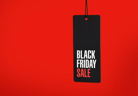
5 Results-Oriented Black Friday Marketing Strategies To Augment Your Revenue
 Team Branex
It’s no wonder that Black Friday can be an equally incredible opportunity for startups, small businesses, and established brands to get more customers and boost their revenue. In the chaos and carnage that ensues the epic four-day splurge, shoppers exuding the right spirit of blessed capitalism, seem to be running a shopping spree marathon. Cyber weekend is one of the biggest shopping weekends of the year. And serves as an amazing opportunity for online marketers to attract a large number of shoppers to their website and convert them into qualified leads.
Hundreds of thousands of consumers are looking for discount offers and exciting deals, which make online marketers invest their best possible efforts towards creating holiday marketing campaigns, winning SEO strategies, impressive landing pages, and engaging Black Friday content to stay ahead of the curve.
Offering enticing holiday season deals and knowing how to promote your offers effectively can help you drive more traffic and Black Friday sales.
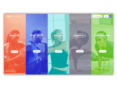
 There is no denying the fact that landing pages are one of the most effective ways to attract more new customers to your business website and promote your holiday-specific shopping deals to them. Designing dedicated landing pages can help brands rank against popular Black Friday keywords, embed interactive and engaging content, and leverage catchy calls-to-action to persuade shoppers to take the desired action. You can create a profound sense of urgency in Cyber Monday/Black Friday landing pages by informing your visitors that it is a limited-time offer that will expire soon.
Let’s take the example of Sage.
The brand that sells account software already has a successful landing page that is generating a substantial number of conversions. So, they just made some minor tweaks to their basic landing page and changed the background image and headline to go with their Black Friday promotional deals.
Have a look at Vimeo’s landing page.
There is no denying the fact that landing pages are one of the most effective ways to attract more new customers to your business website and promote your holiday-specific shopping deals to them. Designing dedicated landing pages can help brands rank against popular Black Friday keywords, embed interactive and engaging content, and leverage catchy calls-to-action to persuade shoppers to take the desired action. You can create a profound sense of urgency in Cyber Monday/Black Friday landing pages by informing your visitors that it is a limited-time offer that will expire soon.
Let’s take the example of Sage.
The brand that sells account software already has a successful landing page that is generating a substantial number of conversions. So, they just made some minor tweaks to their basic landing page and changed the background image and headline to go with their Black Friday promotional deals.
Have a look at Vimeo’s landing page.
 The brand cleverly used its promotion code CYBORG on its landing page and clearly mentioned what they are bringing to the table for the holiday season.
 To find the specific query your target audience is searching for this holiday season, use Google AdWords to find the seasonal keywords. Or simply check Google Trends and BuzzSumo to spy on which topics your users are searching for. This way, you can come up with a perfect seasonal content marketing strategy and create interesting infographics, blogs, and videos that will stand out from the rest. The key is to start planning your seasonal content strategy and promotional offers at least three to four months ahead of time. So you have enough time to think, write, and post strategically.
Remember that content marketing is an excellent tactic to give your brand a boost during the holiday season. With a pinch of creativity, diligent planning, and perfect timing, you can make the most of your seasonal content.
To find the specific query your target audience is searching for this holiday season, use Google AdWords to find the seasonal keywords. Or simply check Google Trends and BuzzSumo to spy on which topics your users are searching for. This way, you can come up with a perfect seasonal content marketing strategy and create interesting infographics, blogs, and videos that will stand out from the rest. The key is to start planning your seasonal content strategy and promotional offers at least three to four months ahead of time. So you have enough time to think, write, and post strategically.
Remember that content marketing is an excellent tactic to give your brand a boost during the holiday season. With a pinch of creativity, diligent planning, and perfect timing, you can make the most of your seasonal content.
 It’s a worthwhile idea to optimize your SEO strategy for the holiday season to make your website stand out in the SERPs. All you need to do is carefully resolve your 404 error pages and place 301 redirects on all your broken links. It is important to make sure that your hosting server is efficient enough to handle high visitor traffic without buckling under the strain.
Conduct in-depth keyword research and leverage the most highly searched terms in tandem with your brand, product, or services to devise your organic search strategy. When you focus on long-tail keywords that entail brand terms, specific product names, and competitive pricing offers such as discounts, deals, coupons, and offers. It will become easier for you to ensure a top Google ranking, which eventually drives more visitors to your website and maximize conversions.
It’s a worthwhile idea to optimize your SEO strategy for the holiday season to make your website stand out in the SERPs. All you need to do is carefully resolve your 404 error pages and place 301 redirects on all your broken links. It is important to make sure that your hosting server is efficient enough to handle high visitor traffic without buckling under the strain.
Conduct in-depth keyword research and leverage the most highly searched terms in tandem with your brand, product, or services to devise your organic search strategy. When you focus on long-tail keywords that entail brand terms, specific product names, and competitive pricing offers such as discounts, deals, coupons, and offers. It will become easier for you to ensure a top Google ranking, which eventually drives more visitors to your website and maximize conversions.
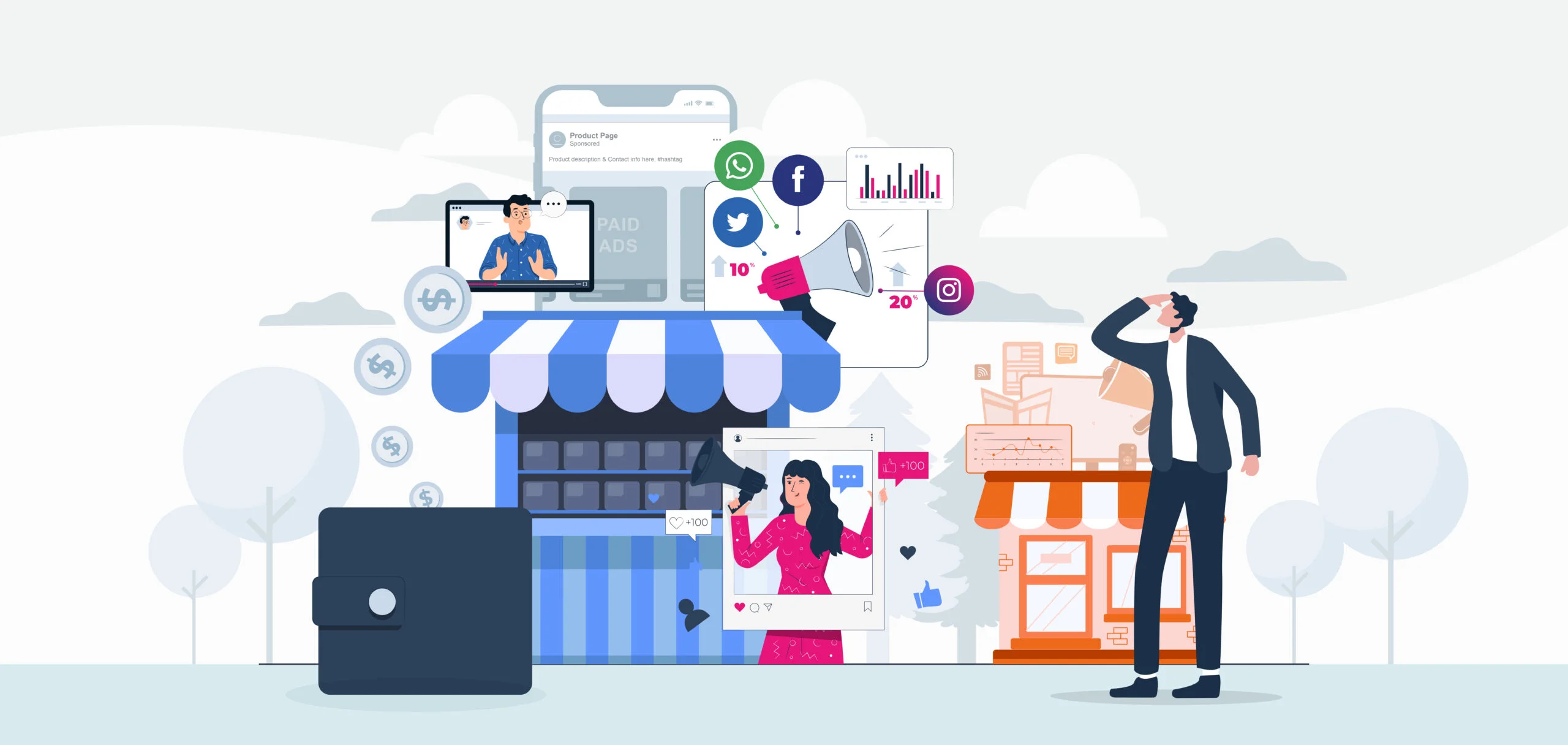 An effective way to promote your seasonal content and holiday landing pages is to advertise them on social and search. Investing in retargeting campaigns is a great idea to capture the interest of people who have already visited your page but haven’t made a purchase decision. Whether you are putting your efforts into paid search campaigns, digital campaigns, or retargeting campaigns. It is important to create a compelling ad copy that can persuade users to take action.
 Social media is the most effective and result-oriented platform that brands can use to promote their products and services and reach out to a wider audience. You can create Black Friday and Cyber Monday marketing campaigns to connect with your audience at an emotional level. In fact, advertising your brand through social media marketing campaigns will help you receive the highest engagement, create brand awareness, and increase your user base. You can use social media to feature user-generated content, and personalized videos that explain the benefits of your products, run contests, and offer a reward program for getting more engagement and shares for your holiday deals.
5 Black Friday and Cyber Monday Marketing Strategies
Here are some workable Black Friday and Cyber Monday marketing strategies that online marketers looking to grab the tail of this Black Friday comet should adapt to augment their sales and traffic.1. Create Landing Pages
There is no denying the fact that landing pages are one of the most effective ways to attract more new customers to your business website and promote your holiday-specific shopping deals to them. Designing dedicated landing pages can help brands rank against popular Black Friday keywords, embed interactive and engaging content, and leverage catchy calls-to-action to persuade shoppers to take the desired action. You can create a profound sense of urgency in Cyber Monday/Black Friday landing pages by informing your visitors that it is a limited-time offer that will expire soon.
Let’s take the example of Sage.
The brand that sells account software already has a successful landing page that is generating a substantial number of conversions. So, they just made some minor tweaks to their basic landing page and changed the background image and headline to go with their Black Friday promotional deals.
Have a look at Vimeo’s landing page.
The brand cleverly used its promotion code CYBORG on its landing page and clearly mentioned what they are bringing to the table for the holiday season.
2. Create Engaging Seasonal Content
Investing your efforts in creating interactive seasonal content early is a great idea to keep your brand top-of-the-mind. When the time comes to make purchase decisions on Black Friday weekend. It is advised to launch your landing pages and holiday marketing campaigns at least a month beforehand. You can create seasonal content, including holiday gift ideas and other interesting topics, which provide useful information to shoppers and make it easier to buy products of their own choice.
To find the specific query your target audience is searching for this holiday season, use Google AdWords to find the seasonal keywords. Or simply check Google Trends and BuzzSumo to spy on which topics your users are searching for. This way, you can come up with a perfect seasonal content marketing strategy and create interesting infographics, blogs, and videos that will stand out from the rest. The key is to start planning your seasonal content strategy and promotional offers at least three to four months ahead of time. So you have enough time to think, write, and post strategically.
Remember that content marketing is an excellent tactic to give your brand a boost during the holiday season. With a pinch of creativity, diligent planning, and perfect timing, you can make the most of your seasonal content.
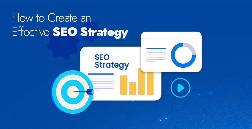
3. Create an Effective SEO Strategy
It’s a worthwhile idea to optimize your SEO strategy for the holiday season to make your website stand out in the SERPs. All you need to do is carefully resolve your 404 error pages and place 301 redirects on all your broken links. It is important to make sure that your hosting server is efficient enough to handle high visitor traffic without buckling under the strain.
Conduct in-depth keyword research and leverage the most highly searched terms in tandem with your brand, product, or services to devise your organic search strategy. When you focus on long-tail keywords that entail brand terms, specific product names, and competitive pricing offers such as discounts, deals, coupons, and offers. It will become easier for you to ensure a top Google ranking, which eventually drives more visitors to your website and maximize conversions.
4. Invest in Paid Marketing
An effective way to promote your seasonal content and holiday landing pages is to advertise them on social and search. Investing in retargeting campaigns is a great idea to capture the interest of people who have already visited your page but haven’t made a purchase decision. Whether you are putting your efforts into paid search campaigns, digital campaigns, or retargeting campaigns. It is important to create a compelling ad copy that can persuade users to take action.
5. Create Social Media Marketing Campaigns
Social media is the most effective and result-oriented platform that brands can use to promote their products and services and reach out to a wider audience. You can create Black Friday and Cyber Monday marketing campaigns to connect with your audience at an emotional level. In fact, advertising your brand through social media marketing campaigns will help you receive the highest engagement, create brand awareness, and increase your user base. You can use social media to feature user-generated content, and personalized videos that explain the benefits of your products, run contests, and offer a reward program for getting more engagement and shares for your holiday deals.

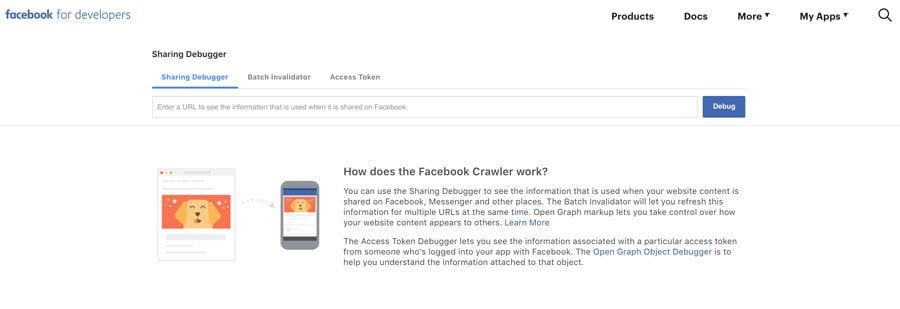 All you need to do is visit the Facebook Debugger page on the Facebook developer site under Tools and Support. Now type in the URL for the particular page you want to preview and click the Debug button. The Facebook debug tool will give you a complete analysis before you share it.
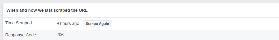
You can see exactly when Facebook last accessed this link and the errors that Facebook has encountered.
Facebook Debugger tool also identifies the actual Open Graph meta tags red flags that need to be addressed.
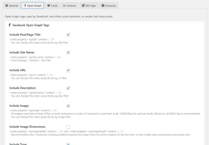
To fix your Open Graph tags, you need a plugin ‘Facebook Open Graph’ that will ensure that the tags are set up accurately.
All you need to do is visit the Facebook Debugger page on the Facebook developer site under Tools and Support. Now type in the URL for the particular page you want to preview and click the Debug button. The Facebook debug tool will give you a complete analysis before you share it.
You can see exactly when Facebook last accessed this link and the errors that Facebook has encountered.
Facebook Debugger tool also identifies the actual Open Graph meta tags red flags that need to be addressed.
To fix your Open Graph tags, you need a plugin ‘Facebook Open Graph’ that will ensure that the tags are set up accurately.
 If everything is working perfectly, you will get the proper preview information.

 You will notice the design is simple, clean, and free of any unnecessary graphics or content elements. They follow a color palette that truly depicts their brand style, and the content is short and to the point. In fact, everything is organized in an efficient manner and doesn't distract users from its real value and offerings. The CTA is clear and obvious, guiding users to take the action, “Sign up for Free.”
 When users visit their mobile website, they are provided with an option to search for a particular product or category. Etsy’s search bar uses an autofill feature to guess what the user is trying to search. Users also find attractive images of trending items in a collage format. Images are clear and big enough that can easily be tapped with the finger.
Etsy mobile website is a great example of easy and efficient site search functionality, making it easier for users to refine their search and browse the products they are searching for.
When users visit their mobile website, they are provided with an option to search for a particular product or category. Etsy’s search bar uses an autofill feature to guess what the user is trying to search. Users also find attractive images of trending items in a collage format. Images are clear and big enough that can easily be tapped with the finger.
Etsy mobile website is a great example of easy and efficient site search functionality, making it easier for users to refine their search and browse the products they are searching for.
 The mobile website design of Dove Men+Care focuses on minimal navigation, simple design, and
  Leans Labs’ mobile web design is a tremendous example of providing an out-of-the-box user experience. The mobile design smartly uses contrast and typefaces to highlight certain elements on the page. The subtle image of a mountain in the background truly depicts how the brands of Lean Labs customers can reach unprecedented heights of success. Their 10x formula is visible on the site and is clearly explained on their site.


 Using different value offers in your ads can help you fight ad fatigue while keeping users hooked to your offer.
 It is suggested to rotate your ads weekly. However, according to some experts, rotating every few days can create positive results. Make sure you keep the individual ad frequency low.
Use the Ad scheduling feature of Facebook Ad Manager and create your own schedule to deliver a different ad to your audience every day. If people see an ad only once a week, chances are they won’t get bored and annoyed. Don’t forget to place
It is suggested to rotate your ads weekly. However, according to some experts, rotating every few days can create positive results. Make sure you keep the individual ad frequency low.
Use the Ad scheduling feature of Facebook Ad Manager and create your own schedule to deliver a different ad to your audience every day. If people see an ad only once a week, chances are they won’t get bored and annoyed. Don’t forget to place  If you are showing the same ads to everyone, chances are your audience will quickly get bored. Rotating your target audience is another sensible decision to serve each group of people with fresh ads. Targeting a specific group of audience can greatly increase your CTR while keeping away the ad fatigue.
In order to rotate between your audience, break down your current audience into different small groups and set up a rotation schedule by changing the audience of each group after a few days.
Keep in mind, that the audience rotating technique is a smart trick that works best if you have a wider audience and each group has specific interests, desires, and needs that differentiate them as a separate group.
If you are showing the same ads to everyone, chances are your audience will quickly get bored. Rotating your target audience is another sensible decision to serve each group of people with fresh ads. Targeting a specific group of audience can greatly increase your CTR while keeping away the ad fatigue.
In order to rotate between your audience, break down your current audience into different small groups and set up a rotation schedule by changing the audience of each group after a few days.
Keep in mind, that the audience rotating technique is a smart trick that works best if you have a wider audience and each group has specific interests, desires, and needs that differentiate them as a separate group.


 Animations are a fun and interactive way to convince users to interact with an application or website. So, make your CTAs engaging to entice the interest of users.


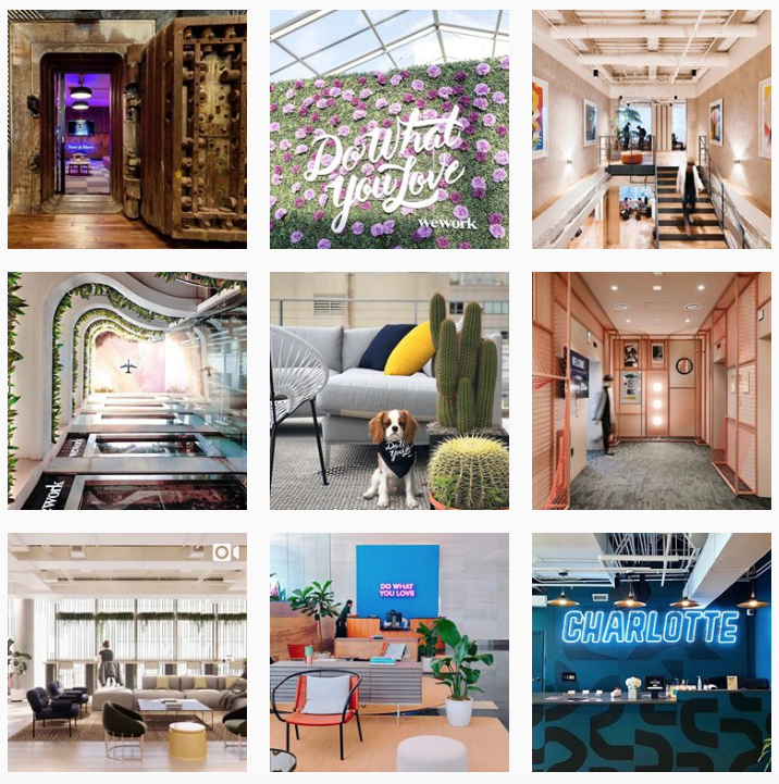 WeWork is doing a great job of engaging its followers by following a frequent and consistent posting schedule. They share engaging, appealing, and promotional posts 2-3 times per day, without cluttering their followers’ feeds.

 Loft is doing a great job of capturing the interest of their followers by consistently updating their story and going live.

 It is important to understand that an omnichannel user experience is different from a multi-channel experience. Omni-channel experiences employ different platforms but keep in mind that not all multichannel experiences are omnichannel. For instance, even if you have effective mobile marketing, engaging social media campaigns, and a great user interface design, what’s the point of having all of them when they don’t work together seamlessly? It is not omnichannel at all.
Omnichannel marketing also works across all those channels, but in a way that best fits the needs of each customer. Some stores such as Home Depot reveal the location of each product in the store to customers beforehand. So customers can navigate through the store using their phones, instead of having to solicit the help of a representative who might flounder for the right answer.
Today, more and more businesses are striving hard to invest their efforts, energy, and resources in creating a multichannel experience. In this ever-changing digital landscape, it is not enough to offer multiple channels or create an exceptional experience in each. The key to success is to put your users at the center of your multichannel design by offering an omnichannel approach that gets potential customers to take immediate action, irrespective of the channel or device.
This way, you will be able to offer an out-of-the-box experience for every user. Regardless of how they interact with your brand. In this regard, omnichannel marketing is about blending different channels together to offer a better buyer’s journey and customer experience. This can mean using the Target app to receive online coupons and then visiting the store to confirm purchases or purchase your morning cup of coffee at Dunkin’ Donuts with the help of their app while you are waiting in line.
Many brands leverage websites, blogs, Twitter, Facebook, Instagram, and various other platforms to engage and connect with their target audience. However, most brands fail to offer an outstanding experience and consistent brand messaging across all channels.
On the other hand, if we talk about offering an omnichannel experience, every platform and device a user will use to interact with your brand delivers an integrated experience. Brands that are using this unique technique can effectively align their brand messaging, goals, and design across every channel and device.
It is important to understand that an omnichannel user experience is different from a multi-channel experience. Omni-channel experiences employ different platforms but keep in mind that not all multichannel experiences are omnichannel. For instance, even if you have effective mobile marketing, engaging social media campaigns, and a great user interface design, what’s the point of having all of them when they don’t work together seamlessly? It is not omnichannel at all.
Omnichannel marketing also works across all those channels, but in a way that best fits the needs of each customer. Some stores such as Home Depot reveal the location of each product in the store to customers beforehand. So customers can navigate through the store using their phones, instead of having to solicit the help of a representative who might flounder for the right answer.
Today, more and more businesses are striving hard to invest their efforts, energy, and resources in creating a multichannel experience. In this ever-changing digital landscape, it is not enough to offer multiple channels or create an exceptional experience in each. The key to success is to put your users at the center of your multichannel design by offering an omnichannel approach that gets potential customers to take immediate action, irrespective of the channel or device.
This way, you will be able to offer an out-of-the-box experience for every user. Regardless of how they interact with your brand. In this regard, omnichannel marketing is about blending different channels together to offer a better buyer’s journey and customer experience. This can mean using the Target app to receive online coupons and then visiting the store to confirm purchases or purchase your morning cup of coffee at Dunkin’ Donuts with the help of their app while you are waiting in line.
Many brands leverage websites, blogs, Twitter, Facebook, Instagram, and various other platforms to engage and connect with their target audience. However, most brands fail to offer an outstanding experience and consistent brand messaging across all channels.
On the other hand, if we talk about offering an omnichannel experience, every platform and device a user will use to interact with your brand delivers an integrated experience. Brands that are using this unique technique can effectively align their brand messaging, goals, and design across every channel and device.
 If you want to make the most of this results-driven marketing technique. It is important to come up with an effective strategy. Work closely with different departments such as sales, marketing, design, and product management to create a workable strategy. Once every concerned department clearly understands the goals and objectives of your omnichannel marketing. It will be easier for you to create an effective strategy and start working on this model.
If truth be told, omnichannel marketing is effective for customers who are looking for a personalized experience. In order to create a seamless and effortless high-quality user experience. It is important to place users at the core of your UX strategy.
If you want to make the most of this results-driven marketing technique. It is important to come up with an effective strategy. Work closely with different departments such as sales, marketing, design, and product management to create a workable strategy. Once every concerned department clearly understands the goals and objectives of your omnichannel marketing. It will be easier for you to create an effective strategy and start working on this model.
If truth be told, omnichannel marketing is effective for customers who are looking for a personalized experience. In order to create a seamless and effortless high-quality user experience. It is important to place users at the core of your UX strategy.
 Disney is capitalizing on omnichannel marketing by making it extremely easy for their consumers to feel a connection. Every small detail of their website is mobile-responsive and intelligently optimized for myriad devices. When visitors book their Disney World resort trip, they can use the
  Bank of America takes its omnichannel UX strategy to a whole new level by providing a dynamic experience to its customers. Users can deposit their checks, pay their bills, schedule appointments, cancel payments, and get cash back from both their mobile and desktop apps.
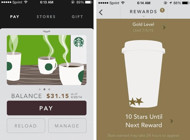 Starbucks has now become an omnichannel savant. The coffee brand is doing a great job of offering a seamless user experience. Starbucks rewards app is a great example of a seamless and effortless user experience. Users get a free reward card that they can use whenever they make a purchase. Starbucks has made it possible for their valued customers to check and reload their cards through their smartphones, via the website, in a physical store, or using the app. Any minor tweak to the card gets immediately rolled out across all channels, in real time.
 Context optimization enables your brand to make the most of the omnichannel approach. Brands can enhance their user engagement by providing the best possible experience that is well-suited for the particular touchpoint.
Oasis is a famous fashion brand that is integrating their ecommerce site, mobile app, and traditional stores into a seamless shopping experience. If you visit their store, you will be welcomed by their sales representatives equipped with iPads, willing to give you accurate and up-to-date product information pertaining to any item you show an inclination for. The iPads serve as a cash register, making it easier for sales representatives to get in touch with you anywhere in the store. On top of that, if the desired product is unavailable, the associates can place an online order for you. Bravo, Oasis!
Context optimization enables your brand to make the most of the omnichannel approach. Brands can enhance their user engagement by providing the best possible experience that is well-suited for the particular touchpoint.
Oasis is a famous fashion brand that is integrating their ecommerce site, mobile app, and traditional stores into a seamless shopping experience. If you visit their store, you will be welcomed by their sales representatives equipped with iPads, willing to give you accurate and up-to-date product information pertaining to any item you show an inclination for. The iPads serve as a cash register, making it easier for sales representatives to get in touch with you anywhere in the store. On top of that, if the desired product is unavailable, the associates can place an online order for you. Bravo, Oasis!
 Crate and Barrel is a furniture and home accessories store that implemented an omnichannel approach to meet its target audience’s needs. The brand makes it easier for potential customers to complete the purchase process through any device. Whenever users log into their account, the app automatically saves their shopping cart and browsing history. So they can access this information across multiple devices. This amazing implementation lets users resume their shopping activity where they left off. Implementing this omnichannel UX strategy in their mobile and website enabled Crate and Barrel to increase their revenue by up to 10%.


 They did a fantastic job of including a lot of information in an organized manner. They include their physical address, phone number, and tour schedule, along with directions and parking instructions that customers might need when they visit the hall.
 Along with using a beautiful hero image, clearly displayed contact information, and an accessible contact form. The brand has smartly peppered in CTAs to persuade customers and make them feel valued.


 Believe it or not, colors play a crucial role in persuading customers to make a purchasing decision. According to
  Visually striking and attractive packaging can take your branding to a whole new level. Neuromarketing techniques are effectively being used to product redesign packaging. Frito Lay used neuroimaging techniques to revive their product design and packaging process. They found that shiny packaging with images of chips triggered negative responses.
However, customers showed an opposite response when the brand used matte bags with images of potatoes. So, they made tweaks in their product design and packaging strategy and moved on with the matte look to create the desired results.
Visually striking and attractive packaging can take your branding to a whole new level. Neuromarketing techniques are effectively being used to product redesign packaging. Frito Lay used neuroimaging techniques to revive their product design and packaging process. They found that shiny packaging with images of chips triggered negative responses.
However, customers showed an opposite response when the brand used matte bags with images of potatoes. So, they made tweaks in their product design and packaging strategy and moved on with the matte look to create the desired results.


