


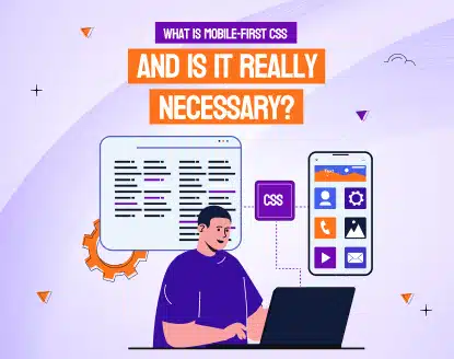
What Is Mobile-First CSS, and Is It Really Necessary?
 Team Branex
When I was a kid, the Internet felt like magic.
I’d spend hours in front of a computer my uncle had introduced me to, completely blown away that there was this thing called the “World Wide Web.” I couldn’t believe I could connect through a server to explore a whole other world hosted halfway across the globe in the United States.
Fast forward to today, and we’ve got smartphones that are literally 50 times more powerful than those old computers we played on as teens. The world has gone full mobile.
It all really kicked off when Apple released the first iPhone in 2007. I remember late nights at cafes with my nerdy best friends, talking about the latest Harry Potter books or getting lost in Lord of the Rings, while plotting crazy strategies for Dungeons & Dragons. Back then, no one really thought a tiny device could change the way we live, surf the internet, or interact with each other. Things started to click around 2012 when Android phones started popping up, giving us more choices and opening the door to a whole new mobile world. Now, almost everyone has a smartphone, and the mobile industry has exploded.
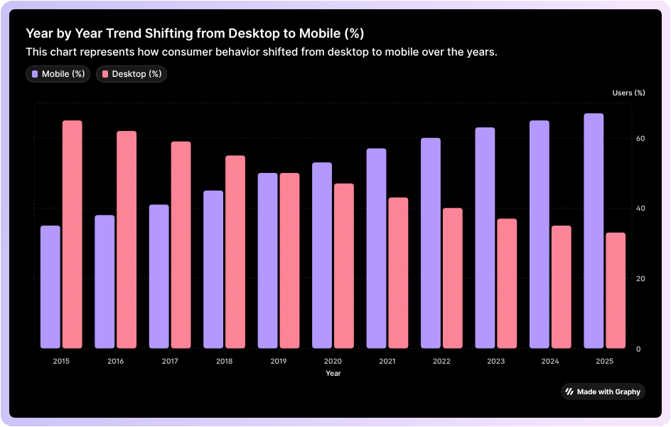
This growth is insane, it's powerful. More than half of all internet traffic now comes from mobile devices, like phones and tablets. So, it’s no surprise that mobile-first CSS is more important than ever. Mobile apps have even become huge money-makers. Take Activision Blizzard, for example—their mobile division alone makes more money than all their other products combined, including World of Warcraft. And yes, a big part of that success comes down to one tiny, addictive game: Candy Crush.
If you’re not thinking mobile-first when it comes to your CSS, you’re basically leaving money (and users) on the table. But don’t worry, we’re not about to let you miss out.
In this article, we’re going to break down what mobile-first CSS is, why it matters, and why investing in it can give your business the edge it needs to rise to the top.
 You see, the desktop experience is quite different from mobile. Mobility mostly depends on taps and scrolls, which is very different from interacting with a desktop using a mouse and keyboard. On a desktop, you often have a consistent connection with stable speed and an unmetered plan. On mobile, however, you’re often transmitting data over metered connections that can come with extra charges. Data efficiency is extremely important, which changes how designs need to be approached.
Similarly, phone signals can drop in low-coverage areas, which means data-heavy web pages might fail to perform or load correctly. This requires a more sophisticated approach to coding.
It shows Mobile-first CSS takes plenty of variables into account making the app experience better.
You see, the desktop experience is quite different from mobile. Mobility mostly depends on taps and scrolls, which is very different from interacting with a desktop using a mouse and keyboard. On a desktop, you often have a consistent connection with stable speed and an unmetered plan. On mobile, however, you’re often transmitting data over metered connections that can come with extra charges. Data efficiency is extremely important, which changes how designs need to be approached.
Similarly, phone signals can drop in low-coverage areas, which means data-heavy web pages might fail to perform or load correctly. This requires a more sophisticated approach to coding.
It shows Mobile-first CSS takes plenty of variables into account making the app experience better.
 Next, you make sure the core content and features actually work. Once that’s solid, you add enhancements for bigger screens such as fancier layouts, bigger images, and extra buttons. This way, no matter what device someone is on, they get a smooth, fast, and usable experience.
Basically, you are designing a website that grows gracefully as it scales rather than trying to squeeze a huge desktop site onto a tiny phone screen.
Next, you make sure the core content and features actually work. Once that’s solid, you add enhancements for bigger screens such as fancier layouts, bigger images, and extra buttons. This way, no matter what device someone is on, they get a smooth, fast, and usable experience.
Basically, you are designing a website that grows gracefully as it scales rather than trying to squeeze a huge desktop site onto a tiny phone screen.
 A lot of people try to “go mobile-first” but end up doing the exact opposite without even realizing it.
Here are some of the most common slip-ups that quietly ruin the whole point of mobile-first CSS.
A lot of people try to “go mobile-first” but end up doing the exact opposite without even realizing it.
Here are some of the most common slip-ups that quietly ruin the whole point of mobile-first CSS.
 Here’s the thing with mobile-first development: it relies on tools and frameworks that are built to prioritize small screens first. Take Tailwind CSS, for example, it’s a utility-first CSS framework that makes it easy to create responsive designs by starting with mobile styles and then adding enhancements for larger screens. Bootstrap works in a similar way, offering a grid system and prebuilt components that are designed to scale naturally from phones to desktops. Beyond CSS, cross-platform tools like Flutter, React Native, and Ionic let developers build mobile apps that adapt seamlessly across devices while keeping performance optimized for small screens. On the testing and responsiveness side, tools like Chrome DevTools and Responsively App let you preview and tweak how your designs behave on different screen sizes in real time, making sure your mobile-first approach works fine.
 Start with the smallest screen first mindset:
Design for a narrow viewport (like 320–375px) before thinking about anything bigger. It keeps you on your toes to only design what truly matters on the page.
Keep your layout single-column by default:
Mobile-first usually means stacking elements vertically. A clean single-column layout keeps content readable and easy to scan.
Always use min-width media queries:
Write your default CSS for mobile, then add enhancements using @media (min-width: …). As a result, your CSS becomes more lead and doesn’t experience any overrides.
You can optimize images and media early:
Use responsive images (srcset, sizes), compression, and modern formats (WebP/AVIF). Because, heavy images are the #1 reason mobile users bounce.
You can increase touch targets and spacing:
Buttons and interactive elements should generally be 44px or larger. You should give everything room, fingers need space, they don’t need pixel-perfect precision.
You should use fluid and flexible units:
Use em, rem, %, and vw instead of fixed pixels where possible. It will ultimately make your design scale naturally across different screen sizes.
You may limit the amount of JavaScript above the fold:
If you have too much JS blocks rendering, keep what’s needed, defer the rest and let the layout load instantly.
Prioritize content hierarchy:
Show the most relevant and important content first, because mobile users scroll fast. They need context immediately.
Test your app in real mobile conditions:
Use throttling in Chrome DevTools by testing your app on mid-range phones and simulating slow networks. Because, real world performance matters more than scoring perfect lab scores.
Start with the smallest screen first mindset:
Design for a narrow viewport (like 320–375px) before thinking about anything bigger. It keeps you on your toes to only design what truly matters on the page.
Keep your layout single-column by default:
Mobile-first usually means stacking elements vertically. A clean single-column layout keeps content readable and easy to scan.
Always use min-width media queries:
Write your default CSS for mobile, then add enhancements using @media (min-width: …). As a result, your CSS becomes more lead and doesn’t experience any overrides.
You can optimize images and media early:
Use responsive images (srcset, sizes), compression, and modern formats (WebP/AVIF). Because, heavy images are the #1 reason mobile users bounce.
You can increase touch targets and spacing:
Buttons and interactive elements should generally be 44px or larger. You should give everything room, fingers need space, they don’t need pixel-perfect precision.
You should use fluid and flexible units:
Use em, rem, %, and vw instead of fixed pixels where possible. It will ultimately make your design scale naturally across different screen sizes.
You may limit the amount of JavaScript above the fold:
If you have too much JS blocks rendering, keep what’s needed, defer the rest and let the layout load instantly.
Prioritize content hierarchy:
Show the most relevant and important content first, because mobile users scroll fast. They need context immediately.
Test your app in real mobile conditions:
Use throttling in Chrome DevTools by testing your app on mid-range phones and simulating slow networks. Because, real world performance matters more than scoring perfect lab scores.
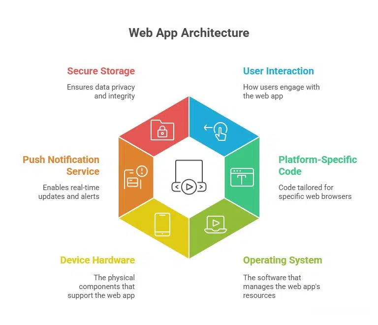
What is Mobile-First CSS?
Mobile-first CSS is a design philosophy. It’s the idea that your mobile experience should be front and center in your product development. It prioritizes your brand for the mobile market. From a technological perspective, mobile-first CSS means we write the interface and style it so that smartphones and other small devices can process information better than desktops.It’s like writing the code specifically for mobile.
You see, the desktop experience is quite different from mobile. Mobility mostly depends on taps and scrolls, which is very different from interacting with a desktop using a mouse and keyboard. On a desktop, you often have a consistent connection with stable speed and an unmetered plan. On mobile, however, you’re often transmitting data over metered connections that can come with extra charges. Data efficiency is extremely important, which changes how designs need to be approached.
Similarly, phone signals can drop in low-coverage areas, which means data-heavy web pages might fail to perform or load correctly. This requires a more sophisticated approach to coding.
It shows Mobile-first CSS takes plenty of variables into account making the app experience better.
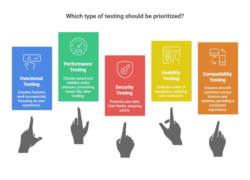
Why is Mobile Experience Different from Desktop?
You see, mobile experiences are way different from desktop experiences for a bunch of reasons. Let’s break them down, which will help explain why mobile-first CSS is so important. Screen Size & Resolution: Almost all mobile devices have smaller screens compared to laptops or desktops, which means content needs to be stacked accordingly. Because mobile screens are vertical, information is arranged top to bottom, including elements like buttons and links, which need to be bigger for touch. Desktops, on the other hand, have plenty of space, so content can be spread out more evenly. Input Method: The way people interact with mobile is very different from desktops. On mobile, you tap and swipe with your fingers, not click with a mouse or type on a keyboard. That means mobile requires larger touch targets, more generous spacing, and intuitive gestures. Desktops don’t use touch as much—they rely heavily on mouse precision and keyboard input. Performance & Connectivity: Mobile users often access the internet through their telecom services, which are usually slower and rely on metered connections (3G/4G/5G, etc.). This means that when people interact with your website or solution, they expect fast loading times, optimized images, and minimal coding. Desktops usually run on high-speed connections, so layout is less of a concern. Context of Use: People often use different mobile devices and log into multiple mobile sessions, which are usually short, fragmented, and on-the-go. Desktop sessions, on the other hand, tend to be longer and more focused, which affects how content is represented to that specific demographic. On mobile, the content is presented in ways which appeal to users in the form of short bursts of attention.How Do You Proceed with Mobile-First CSS Approach?
Think of Mobile-First CSS like packing a backpack before going on a hike. You start with the absolute essentials like water, snacks, and maps, basically the stuff you can’t do without. Once that’s ready, you think about extras like a camera or a sweater. Mobile-first CSS works the same way. Your mindset shift is: You design a website starting with the smallest screen first.
Next, you make sure the core content and features actually work. Once that’s solid, you add enhancements for bigger screens such as fancier layouts, bigger images, and extra buttons. This way, no matter what device someone is on, they get a smooth, fast, and usable experience.
Basically, you are designing a website that grows gracefully as it scales rather than trying to squeeze a huge desktop site onto a tiny phone screen.
The Benefits of Mobile-First CSS
Mobile-first CSS comes with a bunch of benefits, including improved website performance, better SEO, and an overall superior user experience. These websites are also easier to maintain and ready for a wide range of devices. As mentioned earlier, you start designing for small screens and gradually add elements for larger ones. This approach helps create leaner code and reach a wider audience. Here are some key benefits of implementing mobile-first CSS: Well-Optimized User Experience (UX) - It gives you a clean, uncluttered layout so developers can build navigation that is user-friendly and touch-friendly, reducing frustration for visitors. Improved Site Speed and Performance - Starting lean means faster page load times, which is crucial for mobile users on slow connections. Better SEO and Higher Search Rankings - Google favors mobile-friendly websites, helping them load faster, reduce bounce rates, and gain better visibility overall. Essential Content First - Developers focus on the most important content and functionality first, making the website more focused and effective. Easier Site Maintenance and Scalability - Cleaner, more modular code is easier to debug, maintain, and adapt for new devices. Progressive Enhancement - Mobile-first CSS ensures a strong core experience for everyone while adding extra features and enhancements for more capable devices. Also Read: How to Improve Core Web Vitals of Your Website?Common Mistakes People Make With Mobile-First CSS
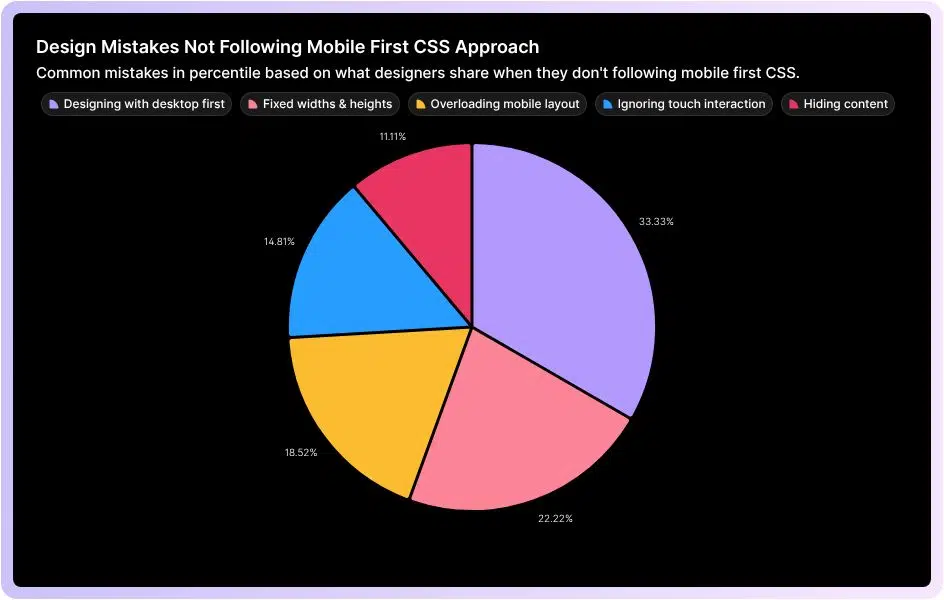
A lot of people try to “go mobile-first” but end up doing the exact opposite without even realizing it.
Here are some of the most common slip-ups that quietly ruin the whole point of mobile-first CSS.
Designing With Desktop in Mind First
One of the biggest mistakes? Starting with a complex desktop layout and then trying to shrink it for mobile. Spoiler: it rarely works. Start with the smallest screen first. Focus on the basics. Once that’s solid, slowly tweak things for bigger screens using CSS media queries (min-width).Using Fixed Widths & Heights
Lots of developers stick to fixed units like px for widths, margins, or fonts. It seems safe… until the layout breaks on a different screen. Instead, go with responsive units like em, rem, %, vw, or vh. These let your design flow naturally across devices.Overloading the Mobile Layout
Ever seen a mobile site that feels like a messy mess? Yeah, that’s usually because someone tried to cram every desktop element onto a tiny screen. The fix? Prioritize content. Start with the essentials for mobile. Secondary info? Hide it in collapsible sections or tabs. Keep it clean.Ignoring Touch Interaction
Here’s a fun fact: mobile users don’t click, they tap and swipe. Desktop-first devs sometimes forget this. Buttons and links? Make them big enough to tap without frustration. Google suggests around 48x48 CSS pixels, with enough spacing so thumbs don’t collide.Hiding Content
Hiding stuff with display: none to “clean up” mobile views? Users hate that. Instead, rearrange thoughtfully. Vertical stacking, simplified menus, or breaking content into chunks works way better than just disappearing info.Tools & Framework That Supports Mobile-First Development
Here’s the thing with mobile-first development: it relies on tools and frameworks that are built to prioritize small screens first. Take Tailwind CSS, for example, it’s a utility-first CSS framework that makes it easy to create responsive designs by starting with mobile styles and then adding enhancements for larger screens. Bootstrap works in a similar way, offering a grid system and prebuilt components that are designed to scale naturally from phones to desktops. Beyond CSS, cross-platform tools like Flutter, React Native, and Ionic let developers build mobile apps that adapt seamlessly across devices while keeping performance optimized for small screens. On the testing and responsiveness side, tools like Chrome DevTools and Responsively App let you preview and tweak how your designs behave on different screen sizes in real time, making sure your mobile-first approach works fine.
How Mobile-First Approach Impacts Conversion Rates
Mobile-first boosts conversion rates because it forces your entire front-end architecture to become lighter and more user-friendly on the devices which most individuals use. When you build mobile-first, your base CSS is minimal. Smaller CSS Payload Equates to Faster First Paint When you build mobile-first, your base CSS is minimal. Desktops only get extra styles through min-width queries. It leads to:- Mobile devices download less CSS
- The browser parses styles faster
- Layout and paint happen sooner
- Optimized Rendering Path Mobile-first encourages developers to load only essential content first. It further improves the Critical Rendering Path by reducing:
- Render-blocking resources
- Unnecessary JavaScript
- DOM complexity
- Smaller, Responsive Images Reduce Latency Part of mobile-first is using responsive images (srcset, sizes) and optimized formats (WebP/AVIF). Mobile browsers automatically choose the smallest appropriate file.
- Better Interaction Through Touch-Optimized UI Technical adjustments like:
- Larger hit areas (44px+)
- Adequate spacing
- Avoiding hover-only interactions
- Using touch-action for smoother gestures
- Improved Core Web Vitals Mobile-first directly impacts CWV, which affect both SEO and conversion rates:
- LCP (Largest Contentful Paint): Mobile-first reduces asset sizes, improving load times.
- FID/INP (Input Delay): Less JavaScript and simpler layouts mean faster interaction.
- CLS (Layout Shift): Mobile-first usually uses more predictable layouts, reducing shift issues.
- Reduced Network Strain on Mobile Data Mobile-first development accounts for:
- High latency
- Metered data plans
- Weak signals
- Progressive Enhancement Encourages Completion Mobile-first is essentially progressive enhancement:
- Core functionality loads fast
- Extra features load later
- The user can complete primary tasks even if scripts fail or the network drops
Practical Tips to Designing a Mobile-First CSS Layout
Start with the smallest screen first mindset:
Design for a narrow viewport (like 320–375px) before thinking about anything bigger. It keeps you on your toes to only design what truly matters on the page.
Keep your layout single-column by default:
Mobile-first usually means stacking elements vertically. A clean single-column layout keeps content readable and easy to scan.
Always use min-width media queries:
Write your default CSS for mobile, then add enhancements using @media (min-width: …). As a result, your CSS becomes more lead and doesn’t experience any overrides.
You can optimize images and media early:
Use responsive images (srcset, sizes), compression, and modern formats (WebP/AVIF). Because, heavy images are the #1 reason mobile users bounce.
You can increase touch targets and spacing:
Buttons and interactive elements should generally be 44px or larger. You should give everything room, fingers need space, they don’t need pixel-perfect precision.
You should use fluid and flexible units:
Use em, rem, %, and vw instead of fixed pixels where possible. It will ultimately make your design scale naturally across different screen sizes.
You may limit the amount of JavaScript above the fold:
If you have too much JS blocks rendering, keep what’s needed, defer the rest and let the layout load instantly.
Prioritize content hierarchy:
Show the most relevant and important content first, because mobile users scroll fast. They need context immediately.
Test your app in real mobile conditions:
Use throttling in Chrome DevTools by testing your app on mid-range phones and simulating slow networks. Because, real world performance matters more than scoring perfect lab scores.


 Partnering up refers to bringing a core software team to set up your infrastructure without having to bear the cost of in-house hiring.
You find a suitable third-party agency who can work on your Agentic AI system on your behalf. This way, you own the product, but a third-party agency designs, develops & maintains it.
Branex is an
Partnering up refers to bringing a core software team to set up your infrastructure without having to bear the cost of in-house hiring.
You find a suitable third-party agency who can work on your Agentic AI system on your behalf. This way, you own the product, but a third-party agency designs, develops & maintains it.
Branex is an 


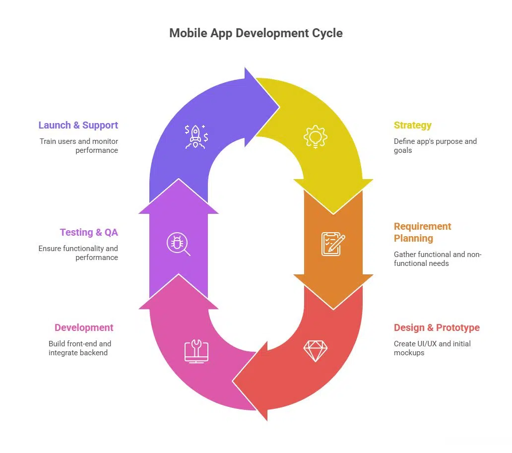 Once we understand your requirements, we will create the outline and initiate a custom mobile application development process personalized as per your organizational culture.
Our process for mobile app development includes:
Strategy - We start with defining the why behind your app. To understand your requirements better, we study your business goals, understand your app user needs, study the ROI, & problems that you wish to solve. We then study your stakeholders (internal users, external users, business owners and end customers). Based on their behaviors, we decide which platform technology native (iOS/Android) or cross-platform will best serve the device type. We further assess what systems to integrate such as ERP/CRM/legacy, or data flows, etc.
Requirement Planning - In the next phase, our project managers and key account executives work with your enterprise to gather functional requirements of the app. It will include what feature set you will want, what the app will do and how it will perform its functions. On the non-functional edge, we understand what security requirements your enterprise needs. What are the performance metrics you follow, and whether you wish to scale your app in the future. It assists us in defining scope, acquiring resources, setting budget & timeline.
Design & Prototype - The design phase is where our mobile app developers start with the initial UI/UX design of your enterprise app. We start with putting together a wireframe and building initial mockups. We share them with your enterprise bodies to review and iterate. As our stakeholders, you provide us with your valuable feedback to refine solutions before we move with the heavy development stages. We also suggest the architect for backend, databases, servers, cloud instances, and device management integrations.
Development - Our
Once we understand your requirements, we will create the outline and initiate a custom mobile application development process personalized as per your organizational culture.
Our process for mobile app development includes:
Strategy - We start with defining the why behind your app. To understand your requirements better, we study your business goals, understand your app user needs, study the ROI, & problems that you wish to solve. We then study your stakeholders (internal users, external users, business owners and end customers). Based on their behaviors, we decide which platform technology native (iOS/Android) or cross-platform will best serve the device type. We further assess what systems to integrate such as ERP/CRM/legacy, or data flows, etc.
Requirement Planning - In the next phase, our project managers and key account executives work with your enterprise to gather functional requirements of the app. It will include what feature set you will want, what the app will do and how it will perform its functions. On the non-functional edge, we understand what security requirements your enterprise needs. What are the performance metrics you follow, and whether you wish to scale your app in the future. It assists us in defining scope, acquiring resources, setting budget & timeline.
Design & Prototype - The design phase is where our mobile app developers start with the initial UI/UX design of your enterprise app. We start with putting together a wireframe and building initial mockups. We share them with your enterprise bodies to review and iterate. As our stakeholders, you provide us with your valuable feedback to refine solutions before we move with the heavy development stages. We also suggest the architect for backend, databases, servers, cloud instances, and device management integrations.
Development - Our 
 In my experience leading Sky Point Crane and ClimaShield Industries, I've seen staff augmentation transform how we tackle specialized projects. We often face the need for niche expertise in areas like 3D lift planning and advanced rigging technologies. By bringing in certified riggers on a project basis, we've been able to execute complex lifts more efficiently without the overhead of permanent hires.
Staff augmentation provides us with the flexibility to respond to the fluctuating demands of our projects. For example, during a large-scale telecom rigging project, integrating temporary experts helped us improve precision and safety, ultimately contributing to faster project completion. This approach allows us to align the right skills with the right tasks, ensuring we stay competitive and adaptable.
By leveraging temporary expertise, we maintain a focus on our core values, particularly solving customer problems with unique solutions. Staff augmentation enables us to put ourselves in our customers' shoes and deliver results without compromising on quality or safety. This method underlines our commitment to responsive service, meeting project timelines, and ensuring our operations are both cost-effective and innovative.
Dave Brocious, Managing Partner, Sky Point Crane
In my experience leading Sky Point Crane and ClimaShield Industries, I've seen staff augmentation transform how we tackle specialized projects. We often face the need for niche expertise in areas like 3D lift planning and advanced rigging technologies. By bringing in certified riggers on a project basis, we've been able to execute complex lifts more efficiently without the overhead of permanent hires.
Staff augmentation provides us with the flexibility to respond to the fluctuating demands of our projects. For example, during a large-scale telecom rigging project, integrating temporary experts helped us improve precision and safety, ultimately contributing to faster project completion. This approach allows us to align the right skills with the right tasks, ensuring we stay competitive and adaptable.
By leveraging temporary expertise, we maintain a focus on our core values, particularly solving customer problems with unique solutions. Staff augmentation enables us to put ourselves in our customers' shoes and deliver results without compromising on quality or safety. This method underlines our commitment to responsive service, meeting project timelines, and ensuring our operations are both cost-effective and innovative.
Dave Brocious, Managing Partner, Sky Point Crane
 Staff augmentation is changing the way companies scale their teams, and we've seen it firsthand in the
  Our work with organizations across industries shows that staff augmentation brings three major benefits. First, it lets companies quickly add specific skills when they need them - like bringing in AI experts or cybersecurity specialists for key projects without a lengthy hiring process. Second, it opens up access to global talent pools, which is essential as more teams work remotely. Third, it helps companies manage costs while staying competitive since they can scale their teams up or down based on business needs. What's particularly interesting is how staff augmentation is changing career paths. More professionals are choosing this model because it gives them variety in their work and control over their schedules.
Also Read:
Our work with organizations across industries shows that staff augmentation brings three major benefits. First, it lets companies quickly add specific skills when they need them - like bringing in AI experts or cybersecurity specialists for key projects without a lengthy hiring process. Second, it opens up access to global talent pools, which is essential as more teams work remotely. Third, it helps companies manage costs while staying competitive since they can scale their teams up or down based on business needs. What's particularly interesting is how staff augmentation is changing career paths. More professionals are choosing this model because it gives them variety in their work and control over their schedules.
Also Read:  Staff augmentation is changing the modern workforce, especially in technology sectors. At NetSharx Technology Partners, we've seen how this strategy enables companies to adapt quickly to evolving tech needs. By bringing in specialized cloud and cybersecurity experts temporarily, organizations can accelerate their digital change without the delay and costs associated with hiring full-time employees.
For instance, a client facing a complex migration to a scalable SD-WAN network was struggling with in-house capabilities. We deployed temporary cloud engineers familiar with the latest SASE technologies, reducing their transition time by 50%. This approach not only cut costs but also allowed their internal team to focus on core business strategies rather than technical firefighting.
With access to over 350 cloud and security providers, staff augmentation provides a unique opportunity to leverage a vast array of skills and experiences. This flexibility is crucial in the current landscape, where technological advancements outpace the ability of many companies to keep up internally. Through strategic partnerships, businesses can maintain a competitive edge and ensure their operations are aligned with the latest industry innovations.
Ryan Carter, CEO/Founder, NetSharx
Staff augmentation is changing the modern workforce, especially in technology sectors. At NetSharx Technology Partners, we've seen how this strategy enables companies to adapt quickly to evolving tech needs. By bringing in specialized cloud and cybersecurity experts temporarily, organizations can accelerate their digital change without the delay and costs associated with hiring full-time employees.
For instance, a client facing a complex migration to a scalable SD-WAN network was struggling with in-house capabilities. We deployed temporary cloud engineers familiar with the latest SASE technologies, reducing their transition time by 50%. This approach not only cut costs but also allowed their internal team to focus on core business strategies rather than technical firefighting.
With access to over 350 cloud and security providers, staff augmentation provides a unique opportunity to leverage a vast array of skills and experiences. This flexibility is crucial in the current landscape, where technological advancements outpace the ability of many companies to keep up internally. Through strategic partnerships, businesses can maintain a competitive edge and ensure their operations are aligned with the latest industry innovations.
Ryan Carter, CEO/Founder, NetSharx
 Staff augmentation is redefining workforce agility—allowing companies to scale fast without long-term risk.
I saw this firsthand when we needed to accelerate a marketing automation overhaul but didn't have the in-house expertise. Hiring full-time employees would have taken months, so we brought in specialized contractors through staff augmentation. Within weeks, they streamlined our CRM, optimized workflows, and trained our team—all without bloating payroll.
The biggest shift? Companies no longer need to "own" talent to stay competitive. Instead of committing to full-time hires for niche skills, businesses can tap into global experts on demand. Whether it's AI integration, cybersecurity, or high-growth marketing strategies, staff augmentation bridges the skill gap instantly.
But the key to success? Integration. We treated our augmented team as an extension of our internal staff—looping them into Slack, strategy meetings, and project roadmaps. This avoided the "outsider" effect and ensured seamless collaboration.
My advice? Think of staff augmentation as a competitive advantage, not a stopgap. It lets you stay lean, move fast, and adapt to market demands without the overhead of traditional hiring. The companies that master flexible talent models will outpace competitors in the modern workforce.
Noel Griffith, Chief Marketing Officer, SupplyGem
Staff augmentation is redefining workforce agility—allowing companies to scale fast without long-term risk.
I saw this firsthand when we needed to accelerate a marketing automation overhaul but didn't have the in-house expertise. Hiring full-time employees would have taken months, so we brought in specialized contractors through staff augmentation. Within weeks, they streamlined our CRM, optimized workflows, and trained our team—all without bloating payroll.
The biggest shift? Companies no longer need to "own" talent to stay competitive. Instead of committing to full-time hires for niche skills, businesses can tap into global experts on demand. Whether it's AI integration, cybersecurity, or high-growth marketing strategies, staff augmentation bridges the skill gap instantly.
But the key to success? Integration. We treated our augmented team as an extension of our internal staff—looping them into Slack, strategy meetings, and project roadmaps. This avoided the "outsider" effect and ensured seamless collaboration.
My advice? Think of staff augmentation as a competitive advantage, not a stopgap. It lets you stay lean, move fast, and adapt to market demands without the overhead of traditional hiring. The companies that master flexible talent models will outpace competitors in the modern workforce.
Noel Griffith, Chief Marketing Officer, SupplyGem
 Staff augmentation is reshaping the modern workforce by introducing flexibility and precision in workforce planning—two critical assets in today's fast-moving, project-driven economy. Instead of relying on a rigid hiring model, companies can tap into specialized talent pools on demand, allowing them to scale their workforce up or down as needs evolve. This isn't just a cost-saving measure; it's a strategy for staying competitive.
Take the tech sector, for instance. When a business needs to roll out a new app, they don't always have the luxury of hiring full-time developers. Staff augmentation allows them to onboard highly skilled contractors who hit the ground running and contribute immediately. When the project ends, those roles naturally dissolve, saving on long-term payroll and benefits.
From my experience, one of the biggest benefits is access to niche expertise. For example, during a large-scale digital transformation at a previous company, we leveraged staff augmentation to bring in data scientists and cybersecurity specialists—roles we didn't need full-time but couldn't do without in that critical period. It allowed us to execute the project at a higher level without overextending our permanent team or scrambling through lengthy recruitment cycles.
This model is also reshaping worker expectations. Highly skilled professionals now seek opportunities where they can work on impactful, short-term projects across industries rather than tying themselves to a single employer. It's creating a more dynamic labor market while forcing businesses to rethink their retention strategies for core staff.
Looking ahead, I expect staff augmentation to grow in influence as businesses embrace hybrid work models and global talent networks. The ability to assemble agile teams tailored to specific needs is becoming a cornerstone of workforce strategy. It's not just a way to fill gaps—it's a key driver of innovation and resilience in a constantly evolving landscape.
James Shaffer, Managing Director, Insurance Panda
Staff augmentation is reshaping the modern workforce by introducing flexibility and precision in workforce planning—two critical assets in today's fast-moving, project-driven economy. Instead of relying on a rigid hiring model, companies can tap into specialized talent pools on demand, allowing them to scale their workforce up or down as needs evolve. This isn't just a cost-saving measure; it's a strategy for staying competitive.
Take the tech sector, for instance. When a business needs to roll out a new app, they don't always have the luxury of hiring full-time developers. Staff augmentation allows them to onboard highly skilled contractors who hit the ground running and contribute immediately. When the project ends, those roles naturally dissolve, saving on long-term payroll and benefits.
From my experience, one of the biggest benefits is access to niche expertise. For example, during a large-scale digital transformation at a previous company, we leveraged staff augmentation to bring in data scientists and cybersecurity specialists—roles we didn't need full-time but couldn't do without in that critical period. It allowed us to execute the project at a higher level without overextending our permanent team or scrambling through lengthy recruitment cycles.
This model is also reshaping worker expectations. Highly skilled professionals now seek opportunities where they can work on impactful, short-term projects across industries rather than tying themselves to a single employer. It's creating a more dynamic labor market while forcing businesses to rethink their retention strategies for core staff.
Looking ahead, I expect staff augmentation to grow in influence as businesses embrace hybrid work models and global talent networks. The ability to assemble agile teams tailored to specific needs is becoming a cornerstone of workforce strategy. It's not just a way to fill gaps—it's a key driver of innovation and resilience in a constantly evolving landscape.
James Shaffer, Managing Director, Insurance Panda
 Honestly, staff augmentation is becoming a core strategy for businesses that need flexibility. Hiring full-time employees for every skill set is expensive, especially for startups managing tight budgets. Bringing in specialized talent on demand helps companies scale faster without long-term commitments. I've used this approach for everything from software development to marketing. Instead of spending months searching for a full-time hire, I bring in experts for high-impact projects. This keeps the team lean while still getting top-tier results.
Workforce expectations are shifting, and businesses need to adapt. Skilled professionals want flexibility, and companies need agility. Staff augmentation makes that balance possible. A startup might need a UX designer for a two-month sprint but not permanently. A growing e-commerce brand may require data analysts during peak seasons. Traditional hiring models don't support that kind of adaptability. More companies will adopt this approach as the demand for specialized skills keeps rising. It's already a core part of how modern teams operate.
Zarina Bahadur, CEO and Founder, 123 Baby Box
Honestly, staff augmentation is becoming a core strategy for businesses that need flexibility. Hiring full-time employees for every skill set is expensive, especially for startups managing tight budgets. Bringing in specialized talent on demand helps companies scale faster without long-term commitments. I've used this approach for everything from software development to marketing. Instead of spending months searching for a full-time hire, I bring in experts for high-impact projects. This keeps the team lean while still getting top-tier results.
Workforce expectations are shifting, and businesses need to adapt. Skilled professionals want flexibility, and companies need agility. Staff augmentation makes that balance possible. A startup might need a UX designer for a two-month sprint but not permanently. A growing e-commerce brand may require data analysts during peak seasons. Traditional hiring models don't support that kind of adaptability. More companies will adopt this approach as the demand for specialized skills keeps rising. It's already a core part of how modern teams operate.
Zarina Bahadur, CEO and Founder, 123 Baby Box
 While managing technical projects, we discovered that fixed teams often had expertise gaps or unused capacity, while augmented teams could flex their capabilities as needed. Then, I realized that the most valuable insight about staff augmentation came from tracking skill utilization patterns.
When implementing complex SEO projects, we found that bringing in specialized experts for specific phases was more effective than maintaining full-time specialists.
For example, during a major site migration, we augmented our core team with a technical SEO specialist for eight weeks rather than hiring permanently. This approach not only reduced costs but also brought in fresh perspectives from someone who had handled similar projects across different industries. The specialist improved our migration process based on experience our internal team hadn't encountered.
Project delivery speed increased by 40% because we could scale expertise exactly when needed. Plus, our core team learned from each specialist, gradually building internal capabilities while maintaining flexibility.
Matt Harrison, VP of Global Operations & Marketing, Authority Builders
While managing technical projects, we discovered that fixed teams often had expertise gaps or unused capacity, while augmented teams could flex their capabilities as needed. Then, I realized that the most valuable insight about staff augmentation came from tracking skill utilization patterns.
When implementing complex SEO projects, we found that bringing in specialized experts for specific phases was more effective than maintaining full-time specialists.
For example, during a major site migration, we augmented our core team with a technical SEO specialist for eight weeks rather than hiring permanently. This approach not only reduced costs but also brought in fresh perspectives from someone who had handled similar projects across different industries. The specialist improved our migration process based on experience our internal team hadn't encountered.
Project delivery speed increased by 40% because we could scale expertise exactly when needed. Plus, our core team learned from each specialist, gradually building internal capabilities while maintaining flexibility.
Matt Harrison, VP of Global Operations & Marketing, Authority Builders
 In my experience as a dentist and practice leader, I've seen staff augmentation transform dental care delivery. At UNO DENTAL SAN FRANCISCO, we implemented a paperless system by bringing in IT specialists temporarily. This allowed us to streamline operations and improve patient record management without long-term hires.
This approach provides flexibility and efficiency, crucial in healthcare where technology rapidly evolves. By integrating specialists as needed, we improved patient care and operational workflow, achieving an 80% patient retention rate. This model can be applied in various settings to optimize resources while maintaining high service standards.
Aghiad Kandar DDS, Chief Executive Officer, UNO DENTAL SAN FRANCISCO
In my experience as a dentist and practice leader, I've seen staff augmentation transform dental care delivery. At UNO DENTAL SAN FRANCISCO, we implemented a paperless system by bringing in IT specialists temporarily. This allowed us to streamline operations and improve patient record management without long-term hires.
This approach provides flexibility and efficiency, crucial in healthcare where technology rapidly evolves. By integrating specialists as needed, we improved patient care and operational workflow, achieving an 80% patient retention rate. This model can be applied in various settings to optimize resources while maintaining high service standards.
Aghiad Kandar DDS, Chief Executive Officer, UNO DENTAL SAN FRANCISCO
 Staff augmentation is revolutionizing the modern workforce by offering flexibility and efficiency elements in today's business environment. From my experience at Gig Wage, I've seen businesses streamline operations by leveraging independent contractors. Our platform is built to accommodate this demand, providing fast and flexible payroll solutions that allow companies to easily tap into gig workers' potential without the traditional HR overhead, thus empowering growth and adaptation.
Take, for example, a mystery shopper platform that used Gig Wage to eliminate a classic payroll manager role. The savings were reinvested into employee development, proving that augmenting staff with gig workers can cut costs significantly while focusing on core business growth. As someone who has transformed and optimized processes in the gig economy, I see staff augmentation enabling companies to meet special project needs with specialized, flexible talent quickly and efficiently.
Through my work with Gig Wage, I've witnessed gig contractors becoming integral to business strategy, not just as a temporary fix but as a long-term competitive advantage. In sectors like hospitality staffing and business process outsourcing, the ability to process payments rapidly for temporary workers allowed management to focus on strategic growth areas, affirming that staff augmentation is not just about filling gaps but enhancing overall business agility.
Craig Lewis, Founder & CEO, Gig Wage
Staff augmentation is revolutionizing the modern workforce by offering flexibility and efficiency elements in today's business environment. From my experience at Gig Wage, I've seen businesses streamline operations by leveraging independent contractors. Our platform is built to accommodate this demand, providing fast and flexible payroll solutions that allow companies to easily tap into gig workers' potential without the traditional HR overhead, thus empowering growth and adaptation.
Take, for example, a mystery shopper platform that used Gig Wage to eliminate a classic payroll manager role. The savings were reinvested into employee development, proving that augmenting staff with gig workers can cut costs significantly while focusing on core business growth. As someone who has transformed and optimized processes in the gig economy, I see staff augmentation enabling companies to meet special project needs with specialized, flexible talent quickly and efficiently.
Through my work with Gig Wage, I've witnessed gig contractors becoming integral to business strategy, not just as a temporary fix but as a long-term competitive advantage. In sectors like hospitality staffing and business process outsourcing, the ability to process payments rapidly for temporary workers allowed management to focus on strategic growth areas, affirming that staff augmentation is not just about filling gaps but enhancing overall business agility.
Craig Lewis, Founder & CEO, Gig Wage
 At Nerdigital.com, staff augmentation has been a game-changer in how we scale, innovate, and stay competitive. In today's fast-moving digital landscape, businesses can't always afford to wait months to hire and onboard full-time employees with specialized skills. Staff augmentation bridges that gap, allowing us to bring in top-tier talent on demand while keeping our core team lean and agile.
One of the biggest advantages is flexibility. When we needed AI specialists to enhance our machine learning algorithms, we quickly onboarded contract professionals with deep expertise - without the overhead of long-term commitments. This allowed us to execute projects faster and test new ideas without disrupting our internal operations.
Another key benefit is access to global talent. Instead of limiting ourselves to local hires, we tap into a worldwide pool of experts, ensuring we always have the best people working on the right projects. It's also an incredible way to foster knowledge transfer - our full-time team learns from external experts, strengthening our in-house capabilities over time.
That said, successful staff augmentation requires strong communication, clear expectations, and seamless integration into company culture. We ensure that augmented staff feels like an extension of our team by using structured onboarding, collaborative tools, and regular check-ins.
In the modern workforce, staff augmentation isn't just a trend - it's a strategic advantage. It enables companies to stay adaptable, reduce hiring risks, and focus resources where they're needed most.
Max Shak, Founder/CEO, nerDigital
At Nerdigital.com, staff augmentation has been a game-changer in how we scale, innovate, and stay competitive. In today's fast-moving digital landscape, businesses can't always afford to wait months to hire and onboard full-time employees with specialized skills. Staff augmentation bridges that gap, allowing us to bring in top-tier talent on demand while keeping our core team lean and agile.
One of the biggest advantages is flexibility. When we needed AI specialists to enhance our machine learning algorithms, we quickly onboarded contract professionals with deep expertise - without the overhead of long-term commitments. This allowed us to execute projects faster and test new ideas without disrupting our internal operations.
Another key benefit is access to global talent. Instead of limiting ourselves to local hires, we tap into a worldwide pool of experts, ensuring we always have the best people working on the right projects. It's also an incredible way to foster knowledge transfer - our full-time team learns from external experts, strengthening our in-house capabilities over time.
That said, successful staff augmentation requires strong communication, clear expectations, and seamless integration into company culture. We ensure that augmented staff feels like an extension of our team by using structured onboarding, collaborative tools, and regular check-ins.
In the modern workforce, staff augmentation isn't just a trend - it's a strategic advantage. It enables companies to stay adaptable, reduce hiring risks, and focus resources where they're needed most.
Max Shak, Founder/CEO, nerDigital
 I think staff augmentation is reshaping the modern workforce by offering businesses flexibility and specialized expertise without the long-term commitment of traditional hiring. I've seen companies struggle with