Blogs

Add the best talent on the market, an agile skilled management & seamless involvement.

Blog Main Image
Creative and Engaging About Us Pages
Web Design & Development

10 Tips To Creative and Engaging About Us Pages

branex-logo Team Branex
Creating an engaging "About Us" page is crucial for building trust and connection with your audience. To make your page stand out, start with a compelling story that reflects your brand’s mission and values. You never get a second chance to make a first impression. Consider this, you are all excited about this event that is happening in your hometown. You get all dressed up and arrive at the venue. Sadly, your friends seem to have ditched you and there is no one you recognize at the event. But, suddenly, a girl approaches you and asks, “Tell me about yourself” and despite all your claims of confidence, you freeze over, and tactfully drag yourself out of the conversation, evading the one question you might never have found the perfect answer to! Well unless you’re Jeff Bezos or Larry Page, you need a solid introduction to impress people. And if you’re an Entrepreneur who is just starting his business or already have a well-established business to your name. You need to have an engaging “About Us” page. Since it acts as the surrogate face of your business, the explanation of what you stand for and who you are. Since the “About Us” page of your website often acts as an introduction, a preliminary handshake, I would venture to say that it is pretty important to get right! Unfortunately, the “About Us” page is the most underrated page and people usually don’t give that much thought when creating one.

10 Tips For Creative and Engaging About Us Pages

But here are 10 “About Us” tips to outclass your competition:

1. Mention Brand Values

Your “About Us” page shouldn’t just be a corporate resume. The idea is to grab the attention of your visitors by listing the brand values most engagingly. You ought to strive to explain your values, describe who you are, and why the service or product you offer is important to you. When you do this, it will help people connect with your brand personality. Find the similarities between your brand and their habits, and trust your brand in turn. For instance, Yellow Leaf Hammocks tries to educate its visitors about how the hammocks they create serve to empower their artisans and their families. They clearly define how they are different from their competitors by saying, “Not a charity. This is the basis for a brighter future, built on a hand-up, not a handout. About Us page for Brand

2. Keep It Simple

When I was in business school, my course instructor gave us an assignment to create a sample About Us page for our virtual company. At that time, I created an exhaustive page (2000 words to be more specific). And yes, it was a total hit. When I graduated, however, I took up the idea and launched my company with the same protracted About Us page. The first few months, people didn’t even bother to stay on my About Us page even for a few seconds. I trimmed down the text, and voila! We were dominating the digital space. When creating an About Us page, the best approach is to keep it succinct and to the point and use simple words to communicate your message. Check out the “About Us” page of I Shot Him. No, wait. No need to call 911; this is not an ammunition-selling company. Nor does it hire assassins to do the job for you. This is a creative design studio in San Francisco that is nailing the“About Us” page with simplicity. Instead of glorifying their services, they have kept it simple. Designing for good causes and good people. Keep it simple

3. Handcrafted Art

What if you wake up tomorrow and receive a hand-crafted birthday wish card from a friend who lives far away? Wouldn’t that be great? How will you feel? Emotional right? This is because it is not just the handwork that matters, it is the love that your friend has put on the card. The same goes for brands. You can use hand-crafted products to describe what your brand does for a living. For instance, if you check out the About Us page of the Made brand. This brand took a totally different approach when it comes to telling what they really do. Just brilliant! Not to mention, the hand-lettering and hand-sketched graphics imbue the page with a humanized feel, not just a brand out there to milk you dry of your hard-earned bills. Handcrafted Art

4. Story-based Timeline

I know what you might be thinking. Storytelling is best reserved for marketing and blogging and an “About Us” page is supposed to take up a paragraph text style. But no, if you want to grab that piece of market share you need to stand out from your competitors. For that, you can use a story-based timeline to tell the story of your brand visually. Just like Moz, you can create a timeline that is engaging, interesting, and personal, using a clean and fun design that incorporates little graphics, concise blurbs, and clear headers to break up the text. Tell the users all that you have gone through in a story-based fashion, and let them in on your milestones and achievements. Story-based Timeline

5. Use the Element of Fun

Comedy can exist in new forms. Technology can be more fun. Homepage copy can be annoyingly vague. This is the landing page you get when you visit the Cultivated Wit website. Cool, isn’t it? No matter how bad your day is going, this intro will surely perk it up. Leveraging the element of humor/fun in your company's About Us page makes it appear more human and resonate with your audience. After all, people find it much easier to trust companies that are fun-loving and adventurous. Use the element of Fun

6. Use Social Proof

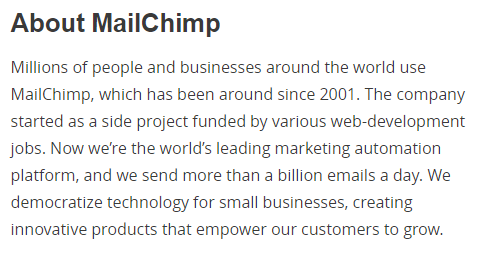
Do you know that MailChimp is used by more than 6 million users worldwide? Even I didn’t know it before I visited their About Us page. This means that people are sending, receiving, and tracking thousands of emails every day. Even if people don’t know how to use MailChimp, people will be impressed by the fact that millions of users are already using it. If you want to gain immediate trust among potential customers, you can use social proof on your company's About Us page. Use numbers that will help users decide whether to go to your website or not. Use Social Proof Method

7. Be the Nerd

Some consider nerds as over-excessively-hyper guys who love technology. For others, Nerds are guys who solve your tech problems. On the other hand, Nerdery believes that nerds are passionate people who love to solve problems. They have leveraged this fact to tell people how excited they are about being a bunch of nerds. Look how “The Nerdery” has used their About Us page to gain attention by focusing on the core of who they are. Be the Nerd

8. Be Creative

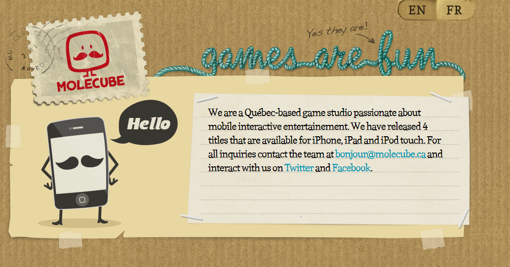
Your About Us Page is not just about filling the white space with text so that your potential customers and investors see something on the website. You can be creative yet simple on your About Us page. This Quebec-based game studio infuses a bucket load of creativity to grab the attention of its users. Be Creative

10. Make it Memorable and Lovable

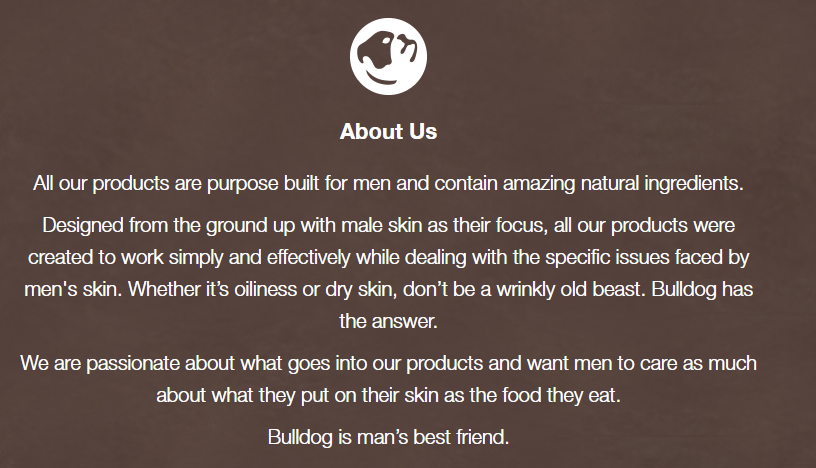
It is not just about telling people what your company does, it is also about touching the hearts of your customers. If you can make your About Us page memorable and lovable, people will remember what you do and share it with other people. When you succeed in creating lovable marketing, you launch a movement of brand advocates and evangelists who will help you grow. Bulldog Skincare managed to do just that. Check out this amazing and loving About Us page. Instead of simply typing out a couple of paragraphs detailing what the company does or where they came from, the brand chose to center its About Us page around the purpose of the products:  to Prevent customers from becoming " wrinkly old beasts." Their colorful, pithy About Us page leads with an adorable mug featuring a bulldog. They have also injected humor and personality into their brand by playing on words. Memorable and Lovable

11. Show Them Something Worth Talking About

One minute of video is worth 1.8 million words, according to Forrester Research's Dr. James McQuivey. Simply telling people what you do doesn’t always cut the bill; you need to show them to let them get a feel for what you do. When audio and visuals are combined with a really riveting story, you can capitalize on multimedia to narrate your brand story in creative ways. For instance, Doomtree is where a bunch of talented artists, each boasting a solo thriving career, occasionally come together to create great music. The brand is built on an unconventional concept backed by an even more amazing story. The brand tells its prime visitors a story in a way that makes them immediately feel something. That's how you create a memorable, lovable marketing strategy. Lovable Marketing Strategy

What About You?

So, there you have it. It is believed that when all is said and done, it is usually what is left behind that makes all the difference. When telling people what you do, make sure you find that sweet spot where customers need to connect with your brand values. If you are not able to craft that perfect About Us page, let us know. We can do it for you.
Create An About Us Page
Guide Web Design & Development

How To Create An Engaging and Steller About Us Page

branex-logo Team Branex
To create an engaging "About Us" page, focus on storytelling to connect with your audience. Share your brand’s history, mission, and values in a way that feels authentic and relatable. What is the typical action of a marketing personnel when he goes up to a prospect? He introduces himself. Without a customary preamble, it is almost impossible to make a prospect even listen to what he has to offer, regardless of whether the product is of any value to them or not. In this digital era, the interaction between a website and a visitor takes on similar semantics. The internet is replete with opportunities in the form of online surfers who are looking for something they are interested in. However, when a visitor lands on your website, where do they turn to learn more about your company and ascertain whether you are the perfect fit for their needs? If your answer is the “About Us” page, you are correct. Your "About Us" page is arguably the first point of contact that conveys core business information to the prospect. The "About Us" page is among the most visited pages on any website and plays an important role in piquing the interest of the online visitor to stay on your website and browse further to satisfy their quest for information gathering. In addition to the design of your business website, your "About Us" page acts as the surrogate voice of your business and leaves that one great impression on your visitors. Not only does the "About Us" page provide vital business information. But it also fosters credibility that is crucially required to finalize the purchasing decision of your customer. Your "About Us" page is the one area of your business website where you actually have a chance to tell your story – what your business is all about, who you are, and what puts you a notch above your competitors. Your "About Us" page gives you an opportunity to enchant a visitor and keep them riveted to your website. If your "About Us" page has been collecting virtual dust because you haven’t bothered to tweak it since you first wrote it off. After all, you always thought that an About page was just a needless and pointless addition, droning on about things nobody cared to read about. Here’s how you can make your "About Us" page resonate with your users, make them trust your business, and nurture long-lasting relations with your customers:

Get the Message Across

The core reason for the existence of any "About Us" page is to inform and educate online visitors about the value that a brand can offer to them. Anything else feels used less if the main purpose is not served at a glance. The customer specifically came to the page to know who you are and this should be communicated without beating around the bush.

Deliver What is Required

The requirements of customers can be as unique as them. Some may want to know about the services that a business provides while others may be interested to know about the staff members that a business has. Your "About Us" page should be tactfully put together using the right visuals and content to create a mix that satisfies every customer requirement.

Provide Proof of Authenticity

A great "About Us" page is one that embodies authenticity within itself as the online visitor reads through it. Customer testimonials, awards and honors received, and brand mentions upon any other online forums validate your authenticity. Thus allowing the customer to take action in a relaxed and satisfied state of mind.

Inspire with Facts

Whenever you are creating content for an "About Us" page, make sure not to repeat what you have already conveyed on your home page or any other page for that matter. Anything redundant will only serve to bore your user and make it feel like you are boasting your brand story. Therefore, instead of going verbose, try putting in some figures that your readers can correlate with and which can create the much-needed interest boost. For example, mentioning that your product helped your client acquire XYZ % of sales would be a smarter move towards instilling persuasion in the content of your "About Us" page.

Try Building a Connection

Connecting with other people and networking is one of the key human behaviors. This important behavior is mostly overlooked when creating content for "About Us" pages. The innate desire of humans to connect contributed to the unprecedented success of social media. Your thought process should follow along similar lines as you create an "About Us" page. Will your visitor be able to connect with you on a personal level by reading this page? You should be asking yourself this question while creating an "About Us" page for your business. To help business owners prevent their prospects from dozing off on their "About Us" pages, here are some impeccable examples of "About Us" pages that are worth discussing:

Chebuono Foods

Chebuono Foods About Us Page Mission Page Luciana Basile Lewis Every brand is unique in its existence. This should be communicated to your online visitor through the content and visuals on your "About Us" page. Chebuono Foods nailed the opportunity by creatively distributing its "About Us" page into segments, each of which conveys a vital message to the reader. Starting from a creative introduction of the business, the page informs the users about the reason for its existence and then introduces the reader to its founders. I found the page an overall great use of the space.

Fueled

Fueled Home Page Design Fueled Information Fueled Collective Fueled is a renowned mobile application development company in USA and they have invested a lot of time and energy into creating an "About Us" page that serves all the right purposes. It kicks off by introducing their people, not by their names but by their traits, followed by a brief about their service offerings and what drives their business forward. The page also talks about the working philosophy of Fueled that could entice clients and other app agencies who would like to work with them or separately at their co-working space. The page distills down to a mention of its most influential clients and awards that the agency has bagged to date.

Moz

Moz About Us Page Moz Story Moz Information 
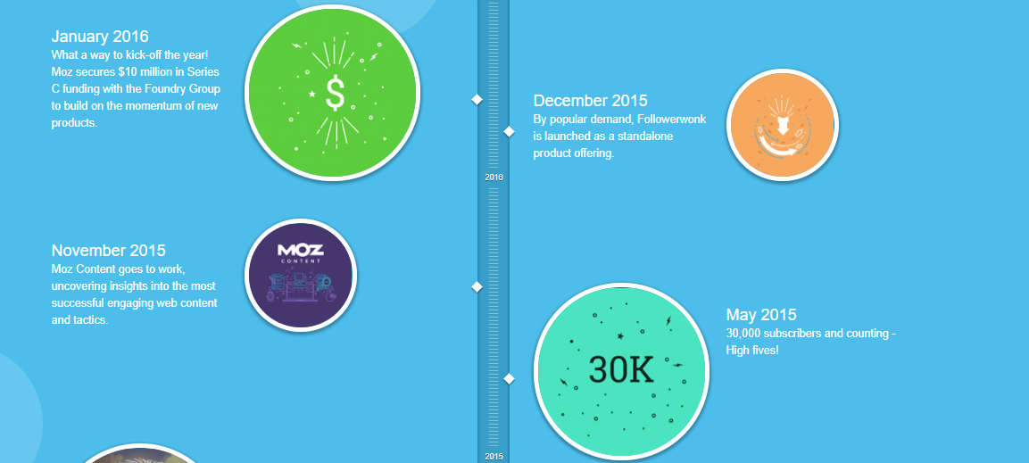
Moz is a globally famed search engine optimization company that claims a very popular blog and some great SEO services under its belt. The company came into inception to drive more traffic toward the websites of other businesses, thus helping them create a more lucrative business space. Their "About Us" page is a treat for the eyes, incorporating a creative header that perfectly depicts their overall reason for existence, followed by an attention-grabbing brand story. However, the most interesting part of the page remains the graphical timeline that represents how the company evolved through time. The timeline dates back to the beginning of the company and highlights the achievements that it has mastered as it grew bigger and stronger. This "About Us" page is one of my favorites as it pinpoints all the right elements most appropriately. With a strong narrative and visuals that support the overall aim of producing the "About Us" page. This page is definitely one that other business owners must look up to as an inspiration.

HubSpot

HubSpot Page Success with Your HubSpots Product with a Personal “It was time to make the marketing and sales process human. Time to treat buyers like people, not numbers on a spreadsheet. Time to build an inbound community and help people achieve their business goals in a more personable, empathetic way. We called it, HubSpot.” Probably the best "About Us" page description that I have ever witnessed in ages. HubSpot offers a full stack of software for marketing, sales, and customer success processes, with a completely free CRM at its core. They’re powerful alone — but utterly invincible when used together. Hubspot has definitely taken an off-the-shelf approach for this page development and has incorporated the vital essence of the brand in it. By unconventionally describing their products and services, they hinted at the uniqueness that they can offer to a business. With each section of the page communicating information that it was intended to, I would definitely rate this "About Us" page among the best. There can be various approaches to creating an "About Us" page. It can be formal or totally creative, depending on the offering of the business. Every brand has a different personality and the "About Us" page must extend it to the target audience effectively. For more ideas on how you can create an effective "About Us" page for your business, you can get in touch with a professional web design and development agency in the United States.
Web Designer Roadmap
Infographics Web Design & Development

Web Designer Roadmap: How To Go From Where You Are To Where You Want To Be

branex-logo Team Branex
With billions of websites in cyberspace, you will have to design a website that stands out from the crowd to get noticed. This makes the job of web designers even more difficult as they do not only have to design a website. But also design a unique website that delivers the best user experience. Even though, this might be easier for an experienced web designer what about a new web designer who has just entered the industry with big dreams? An inexperienced web designer is usually unaware of the steps involved in designing a perfect website. To help those designers get a grasp of the web design roadmap. This infographic will clearly define the step-by-step process you need to follow to create winning website designs. Here is a roadmap for web designers that will take them through the paces and help them in designing pixel-perfect websites. Web Designer Roadmap
Impact of Minimalism in Web Design
Web Design & Development

The Maximalist Impact Of Minimalism In Breathable Web Design

branex-logo Team Branex
Minimalism in web design enhances functionality, improves load times, and makes content more accessible by removing unnecessary elements, allowing users to focus on key features. This approach fosters clarity and ease of navigation, which can have a maximalist effect by amplifying the site's usability and overall aesthetic appeal, creating a bold and memorable impact. Imagine your exasperation if someone takes you to a room as cluttered and screaming chaos as the one in the picture above us, and asks you to focus. Your immediate reaction would be, “What exactly should I focus on?” The same goes for websites. Early in the first Jurassic Park film, the hipster, mumbly scientist, questions the creators of the park by saying, “Your scientists were so preoccupied with whether or not they could that they didn’t stop to think if they should.” Similarly, just because you have tinkled with your web design knowledge and know how to add bells and whistles to your website. It doesn’t mean that your next web design project is the place to flaunt it all! A Website design is essentially like a room, where each one represents a business and sells a unique value proposition to its customers. However, a cluttered website design may distract the online visitor from the focal point and the theme of the site, and may as well confuse them, eventually compelling them to bounce off. The core function of any website design is to create a great user experience which is achieved by creating aesthetically pleasing and functional websites. Too many elements that demand attention and divert the concentration of the users on any website design can wreak havoc on the achievement of a great user experience. In fact, well within 50 milliseconds of exposure, visual complexity can have a huge impact on the user’s perception of the site, which is exactly why the world is now turning its focus towards a minimalistic approach to website design. As Antoine de Saint-Exupery, a French writer has said, “Perfection is achieved, not when there is nothing more to add, but when there is nothing left to take away.”

How Did the Minimalist Design Approach Come to Life?

Although minimalist design is a relatively new trend in website design, the idea has been in and around the industry for quite a long time. Decades before minimalism crawled its way into web design, it started off as a visual art movement in the wake of World War II. It popped up as a reaction to the marked subjectivity, motion, and chaotic colors often found in a plethora of abstract expressionist works. In the 1960’s, minimalism had also snaked its tendrils into the fields of fine arts and architecture. Minimalism was characterized in visual art by industrial materials, serial arrangements, geometric elements, and monochromatic palettes. The depiction of its presence lies in a few of the global cultures that have used the minimalist approach in their architecture and societal planning. Cultures like the Japanese have valued simplicity and have used this technique in creating various forms of art and architecture for a long time and the influence can still be seen in the modern-day architecture within the country. Modern Day Architecture The influence of “less is more” dispersed to other cultures soon and was appreciated by enthusiasts who valued creativity. The focus-building capabilities of this movement allowed the minimalist design approach to cast its spell on the website design industry and was soon accepted as a leading trend in website creation.

The Minimalist Approach in Today’s Website Designs

The emergence of minimalism in modern-day website design and development doesn’t date back too long. However, the trend has seen significant growth and appreciation within the past few years of existence. The visual complexity of website designs has been adversely affecting the lead generation capabilities of the promising medium and is found to affect the user’s perception regarding the brand itself. Therefore, as a replenishment therapy for the website design, minimalism was approached to correct the areas where the errors occurred. Minimalist design is design at its most basic; devoid of all superfluous textures, shapes, and color. Not only did minimalism help in bringing back the element of focus in the website designs, but it also catered to some of the elements that were attributed to the success of an online website. Faster loading, lighter weight, and better compatibility were to name a few. Perhaps, one of the most prominent examples of minimalism is Google search. With fewer elements, Google has opted for simplicity in its web interface ever since it existed. You can see that their main search page was designed around a core functionality, eliminating any other distractions that could create complications. Google Search 
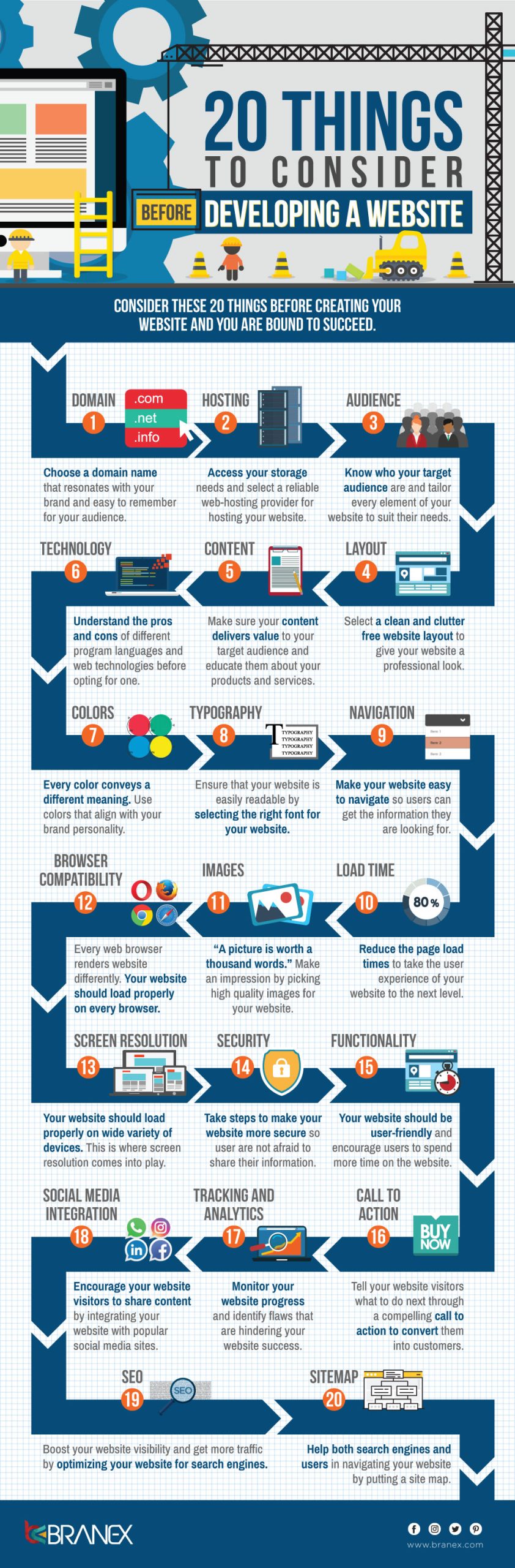
Let’s take a closer look at the elements that help incorporate minimalism for greater-looking website designs:

Focus on the Essentials

To create a truly action-inducing interface, a website designer should only focus on the essential elements that are required to communicate the business message effectively. This can be achieved by putting a distinct focus on one bit of content, eliminating competition from surrounding elements, so that it basks in the limelight. Showing elements that are important for business development and stripping away the unnecessary baggage allow the website to breathe and the customers to easily go through the content without much ado. The main aim is to make the primary action, which is desired by the business, easily attainable through the website. Jan Reichle Minimalism Designer For instance, in the website above, the splash of bold color against a white background, one graphic element, and just one block of text is sure to draw the eye of the user. The graphic element introduces shape, texture, and color. Since it defines the designer’s identity and brand, it is the single most important thing on the page. Since this graphical element is already pretty complex, peppering in more content on this page would have rendered it less conspicuous. The designer struck the right balance by reducing the amount of elements on the page.

Effective Use of Negative Spaces

A negative space (or white space) is the most common element of the minimalistic design approach. To get your head around negative space from a layman’s perspective; it is the white space that is present in and around the content on a website design. Negative space helps to manipulate the visual flow of the user. Your eye is naturally drawn to an element surrounded by negative space. Negative space also opens up room for a more comprehensive organization of various elements on the screen. The trend has shifted towards more usage of negative space in a website since it builds an emphasis on existing elements and enhances their visibility. It is not necessary that you have to leave idle white space that falls under the negative space umbrella. They can be solid colored spaces as well, that were left akin to open plains on a website landscape. Effective Use of Negative Spaces For instance, Chanel understands how indispensable white spaces are to creating an ambiance of rarified sophistication. Chanel hasn’t been taking the market by storm for eons by a stroke of luck. Its stellar website is the epitome of keeping your users riveted. Higher Plan Negative spaces aren’t restricted to ultra-minimal layouts, as we see on the website of Brighton Agency Buffalo. All the navigation elements of the website are portrayed in a hexagonal kaleidoscope of colors, clustered together in a lattice, separated by calming white spaces that thwart the web page from appearing to have chewed off more than it can swallow. Even though the web page is vibrant and incorporates a lot of elements, it still manages to exude a relaxed and laid-back feel.

Use of Colorful Visuals

Visuals are the most important element of any design. In a website design that is created with a minimalistic approach in mind, it is better to use visuals that are vibrant in nature to compensate for the negative spaces left in the design for better emphasis building. This is not the only use of vivid visuals in a web design. They also make the overall design look creative and aesthetically pleasing. Use of Colorful Visuals For instance, the bright pops of color in the web design shown above make the design come to life and instantly serve to capture the eye of the user.

Bold Typography with Contrast

The typography used in website design highlights the content and helps in the easy transition of information from the design to the customer. Dynamic, sharp, and bold typographic elements grab attention faster than flat and simple ones. Couple them with a high-contrast theme, and you will be able to create a winning mix of elements that are bound to create customer’s interest in your web design. Typography is famous for crafting a larger intriguing visual, while at the same time bringing immediate focus to your words. Bold strokes and interesting letter forms are a favorite in minimalistic designs to make a huge impact. Minimalism Designs For instance, Werkstatt Studio keeps it simple with modest yet striking typography that further boosts the aesthetic appeal of the breathable website with smooth animations.

Simple Navigation

Have you ever heard of the hamburger menu? It is when the simplest of navigational tools meets simple design aesthetics. Even designers who are yet novices to minimal frameworks are ditching the age-old traditional navigation in favor of hamburger menus. Remember the websites of yore, when it was deemed trendy to flaunt all your navigational elements out front, for users to take in at a glance? If you still don’t believe how big a deal hamburger menus are, we dare you to browse through a vintage website and find your way around with all those unaccounted-for navigational elements sprawled around. Using a hamburger menu trims down the number of UI elements on a page and makes it appear clean and spacious. Simple Navigation Design For instance, getting rid of all UI elements enables the copy to occupy a leading position and shine out. The menu icon subtly complements the web page design, and the open spaces enhance the visual weight of the tagline. Visual Weight Tagline This website is also the epitome of modern-day minimalism, incorporating plenty of white spaces, a cluster-free façade, and a neat layout, further cemented by a hamburger menu, which blends in with the overall luxurious and open design of the website and doesn’t serve to deviate a user from its purpose.

Less is Indeed More

The minimalistic approach to web design is a relaxed approach that emits timelessness. Through the simplicity that minimalism brings to a website design, better business generation can be achieved by allowing the online visitor to focus only where attention is required. By removing the design clutter, you actually pave a path for leads to come towards you with lesser efforts invested in the lead generation process. Appropriate use of all the elements, while maintaining the boundaries of minimalism, guarantees the successful execution of a persuading website design.
Scary Halloween Websites
Web Design & Development

5 Scary Halloween Websites For True Horror Fans

branex-logo Team Branex
So, are you ready to carve a classic jack-o-lantern out of your pumpkin? Or maybe you’re looking for blood-chilling costume ideas for your Halloween party. Or maybe you want some custom website design ideas for your Halloween website. Halloween is one of the most thrilling holidays of the year. And they say it is a season to be with your family that makes it special. Attend costume parties, play divination games, carve jack-o’-lanterns, visit haunted attractions, tell scary stories, and watch horror movies. The to-do list is endless. You can get ideas from the internet and do whatever feels creepy to you. You can try trick-or-treating on your own, or you can take inspiration from these scary websites.

1. IT Movie

IT Movie for Halloween 
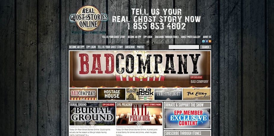
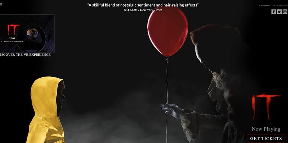
From the pen of Stephen King, comes a horror flick that will keep you glued to your seats. And this movie will also intensify your fear of clowns. It’s not recommended to watch for people having coulrophobia, the fear of clowns because the main character Pennywise the Dancing Clown will keep you away from the kitchen even to drink a glass of water. For the Halloween, website inspiration check out the 360 Cinematic VR tour and act like a real-life hero. The website is just a collection of movie trailers and teasers. Do also check out the masonry gallery on the homepage, you can check the on-set photography & HQ screencaps from the movie. Also Read: Halloween Marketing Ideas to Increase Customer Engagement

2. CreepyPasta

Creepy Pasta 
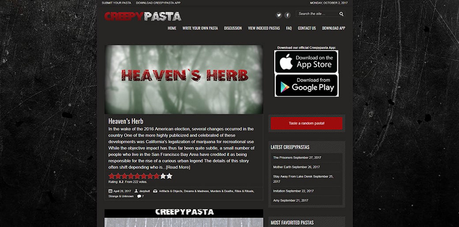
If you’re planning to give a good scare to your friends at the Halloween party, here is one of the scariest Halloween websites that will contain some roof-raising creepy content. From stories, myths, and supernatural tales, to the history and origin of vampires, and werewolves. Creepy Pasta is frequently updated. To make things creepier, people share their own real-life scary experiences and stories.

3. Bloody Disgusting

Bloody Disgusting Bored on All Saints’ Eve. Well, check out the Bloody Disgusting website. A full-blown website for all the horror freaks out there. Filled with stories and a selection of movies, scary videos, and video game reviews. This is one Halloween website that will surely drive your horror cells into action. There is also a horror forum for fans that are willing to share horror culture-related artifacts. If you want more Bloody Disgusting, there are several social media profiles you can follow to get the latest updates on what’s new in the world of horror.

4. Fangoria

Fangoria 
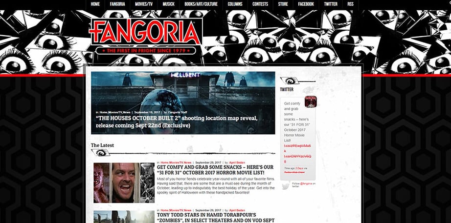
The next one is the ultimate favorite of horror movie fans. In the Halloween website collection here is Fangoria, an online portal that is dedicated to horror culture. A website that is designed to capture horror fans with ghostly stories and real-life tales. Interviews with stars of horror movie characters. Here you will find a book and comic, game and toy, movie reviews, mixtapes, and a lot more.

5. Real-Life Ghost Stories

Real-Life Ghost Stories

Want some real-life ghost stories, here is your chance to get some inspiration. People who have had paranormal experiences of any kind are encouraged to share them without fear of being judged. Real Ghost Stories can be the soundtrack of your Halloween party if you want to frighten your guests to death.

Call-to-Action

Our digital marketing agency cares more about your ROI than your profits. That is why we are here to turn your ideas into reality. For award-winning websites & game-changing apps contact us now!
eCommerce Website Design Elements
eCommerce Web Design & Development

Win Over Your E-commerce Visitors With Beautiful Website Design Elements

branex-logo Team Branex
It was the design of the pen. Yes, the design which I still have in my memory. People might forget the words you had on your website, and people might even forget the images they saw, but one thing they won’t forget is the experience they had on your website. Once upon a time, when I was little. I used to admire this one pen. I cannot point out what exactly I love about the pen. Was it the flow of the writing? Was it the grip of the pen? But now I know what was it. Certainly, some things keep people engaged with your website. Most of the professional website design agencies have cracked the code for this. And now it is time for you to do the same. Let us first consider some basic tips.

What Makes Are E-commerce Website Designs Engaging?

1. Quality Product Photos:

Product photography is one thing that can help you engage more users than the design layout. Avoid using stock photos. Use real-life photos that are either actual humans or photos that are taken by professional photographers.

2. Easy Navigation:

It is not just about organizing the photos and text, a great website is a combination of photos, text, and how it is organized on the website. How customers feel while visiting your website. Can we find what they’re looking for? Are they facing issues while browsing the website?

Also Read: 7 Tips to Multiply Your eCommerce Sales

3. Promotional Messages:

Nothing strikes a user more than a persuasive text. An email, a greeting message, or a pop-up sign. Try out anything that resonates with your user. Check the response of each action item and see how customers are taking everything.

4. Killer Content:

You can persuade the user by the design, and you can even persuade the user by product photos, but one thing you must do is use killer content to grab the attention of the user. Using engaging taglines and cutting-edge vocabulary can take your website to the next level.

Captivating Demos

One of the ways to improve the usability of the website is to use product photos that can help the visitors relate their problems with their problems You can even use videos or 360-degree views & image zoom that put users in charge of the interface of the website. The aim of the store should be to create an experience. For instance, in a store, users can pick up the item and feel it in their hands. Providing images of every side of the product as well as a close-up view helps to provide a more tangible experience. Customers can view the product up close and personal. Captivating Website Design

Use Emotions to Force Action

The logo, the color, the image, and all the pieces of content of your website will evoke an emotion among the visitor. What you need is, to use that spike to force an action for the user. Remember, humans, want an emotionally authentic experience online. So (just as on Bold and Noble in the section above), set the mood of your brand with a unique style and match it with your tone, which can be conversational, humorous, cheeky, or whatever will further create that emotional connection between you and your customers. And, this is a good place to remind you that you must really know your audience to know how to create authentic emotions. As a shoe retailer, this brand sets itself apart by using a bold tone of voice. They aren’t shy in making sure their customers know that their shoes are made by renowned craftsmen, but they also keep it short simple, and conversational. This tone of cool confidence provides its customers with a base of trust, especially with the human-like voice. And they keep the same tone of voice with every aspect of the site: feedback, suggestions, explanations, and more. Shoe Website

Create a Seamless Experience

When I was starting out my venture for an ecommerce website, I visited around 300+ websites. Tried and tested every single one of them. What was I looking for? A seamless experience. Finally, I got one from a website. And next, I went to an ecommerce website design agency to create my website. Why is it important for the developers or the owners to create a seamless experience? Because the users are fed up with the conventional ways of browsing the website. Now the customer's trust is established upon the retailer experience that is given to the customers. If the customers see the same look, again and again, they will lose track of attention and nothing will be the same. You need to create an experience that will force the user to stick to the design. Make the user fall in love with the experience.  Don’t try to make a complex design, just make a simple one that can catch the attention of the user. One prime example is Zappos. What I love about Zappos is the possibilities for fine-tuning the experience to my own preferences, so that I can shop on mobile, the website, or in the store exactly how I want.  Zappos Web Page

Social Sharing Options

One of the best ways to provide a powerful human experience through online retail shopping is to include a social feed that creates a bandwagon effect. Everyone is talking about your online store, so it must be great – an experience that we just can’t miss! Social media has become a huge part of our daily lives and is ingrained in the human experience for a great many people. Those sponsored Facebook ads, sponsored Tweets, promoted Pinterest pins, and even YouTube video ads are all an important part of making a connection with customers, promoting expression, and providing that human experience. Making that connection between the website and social media can be further enhanced with some simple design tweaks. The Eden website places social media icons in the header of their website for easy access. This not only gives customers more than one option for staying in touch but also reinforces the legitimacy of the brand in the minds of new customers.
Developing a Website
Infographics Web Design & Development

20 Things To Consider Before Developing a Website

branex-logo Team Branex
Gone are the days when businesses could do away without a website. In today’s hyper-connected world, having a website is not an option anymore. It is a must-have weapon in your arsenal if you want to win and succeed in today’s internet-dominated world. Even having a fully functional website does not guarantee success. Your website should be visible at the top of search engine rankings, attract visitors, and convert them into paying customers. Phew! That is a steep challenge for web designers and developers. Every business wants to deliver an immersive user experience to its website visitors and turn them into loyal brand advocates through their website. Unfortunately, that is easier said than done. Designing a website that meets your business goals requires effective planning and execution and the right approach to market in order to achieve success. Your website is the face of your company online. It should convey a brand message you want it to communicate to users. Keep your target audience in the back of your mind when designing your website. Answers questions such as how users will perceive and interact with your website to develop a website that satisfies users. To make your website creation journey easier, here are 20 things you need to consider when developing a website to hammer the nail on its head. Developing a Website
Construction Business Website Templates
Web Design & Development

7 Highly Creative and Aesthetic Construction Business Website Templates

branex-logo Team Branex
Real estate and construction businesses are on a steep rise in various states of America. Americans seem to be getting really interested in real estate investment and many are witnessed to have invested in the construction business to make a fortune. To gain a competitive advantage in the construction business, a construction-themed business website is a must-have and a beneficial tool that could generate highly prolific business leads for you. To craft an aesthetically pleasing construction website, there are myriad construction templates available that offer exciting ways to connect your business to your prospects. Branex, a professional and custom website development company in the United States, has come up with some minimalistic yet pretty construction website inspirations for infrastructure developers to choose from and get a great-looking business website for their venture.

Pedosis

Pedosis is a responsive HTML template that is specifically crafted for construction and other related niches within the industry. The template pack comes with 22 valid templates and 10 PSD files with well-named and organized layers for your in-house designer to adjust them according to your taste. Pedosis is a well-designed HTML template which deals with the construction of niche sites. Along with the easy customization that the template has to offer, with a 1170px grid. It comes with a super-easy color scheme, but it can also be customized according to the custom CSS file. Through Pedosis, its website building was made easy. Pedosis Construction Business Website

Roofers

Roofers is a unique and clean template for roofing companies and contractors with location finders. Roofer is an HTML5 / CSS3 template that proves to be the best choice for roofing contractors and prime contractors, and is suitable for the management of vendors and traders. This theme is perfect for people who are involved in businesses of plumbing, contracting, construction, roof heating and cooling, etc. The template not only comes with a lead capture form but also has a call-to-action button that can be hyperlinked to any external page. Roofers - Construction Business Website

Building Agency

Building Agency is an HTML template that is best suited for businesses who are related to contracting, construction, and/or providing related services. This website design template is a fully responsive Bootstrap grid system that features a unique and clean design that is suitable for construction businesses, along with multiple home page design variations to choose from. It has a 1170 grid design system that comes with free Google fonts, flat icon fonts, and much more. Building Agency - Construction Business Website

Constrion

This easy-to-mold website design template comes at a mere cost of $16. It is an especially designed website template that works best for people who offer constrion services. It offers a responsive layout that is perfect for display on any device, be it an Android-based smartphone or an iOS device. Constrion includes an easy-to-code and comment system that even a novice can use by themselves. Super Responsive, Valid HTML5 & CSS3, Working PHP / Ajax Contact Form, Effects and functionality, Smooth transition effects, Cross Browser Optimization, Font Awesome Icons, Google font, Customization. Constrion - Construction Business Website

Build Press

A premium HTML template that is perfect for any kind of construction business and companies offering related services to clients in the United States or abroad. BuildPress is probably the best in class and easiest to use template in its category. This theme is available to download at ThemeForest for just $16. Its main features are a 100% responsive web template, shortcodes, filterable portfolio, sticky or regular navigation, working contact form, testimonial slider, optimized code, along with a main page PSD file, and direct support from the template builder and Google web fonts. Build Press - Construction Business Website

Construction

Construction is a modern and clean HTML template designed for any kind of construction and building company, architectural firm, freelance architect, or construction business website. It has a responsive design which makes it a perfect fit for all devices.  The template offers everything you need for your Construction website. It includes Projects, Services, News, Blogs, Teams, Clients, and much more. Construction HTML Template is very easy to customize; it is a great, professional, and easy-to-use template. Features: Fully Responsive, Foundation 5 Framework, HTML5 & CSS3, SASS, Font Awesome, Easy Color Change, 11 PSD Files Included, 15 HTML Files, Google Maps Integrated, Sliders, Tabs, Carousels,  Accordions, Based on 1200px grid system, Parallax background, Cross Browser Compatible (IE 9+, Chrome, FF, Safari, Opera). Construction Business Website

Homify

Homify – house plans and construction. This is probably the only template that is dedicated to house plan companies. It offers a multiple-house plan listing layout as well as a single-house plan layout. It can be effectively used for both large-scale websites selling house plans or simple small websites that are used by novice builders or construction companies it uses Open Sans as the main font along with Montserrat and Raleway. Homify - Construction Business Website

Conclusion

Real estate and infrastructure development has evolved as a developing business industry in the United States in the past few years, and its constant evolution is the reflection of the benefits this business industry has to offer to the players operating within it. Branex has proudly provided website design and development services to some of the prominent real estate companies and realtors in the USA, and the templates shared with you above only reflect a fraction of the expertise that the company can offer to you. For a detailed review of your business and its requirements, get in touch today.
real estate web design
Web Design & Development

9 Hot Website Design Trends That Have Transformed The Real Estate Business

branex-logo Team Branex
Website designing is a swift-paced industry, and even swiftly, the trends in the website design world change. But, it also happens that some promising trends keep their position and stay, while newer trends emerge. Another business industry that is making waves in the international business markets is real estate. According to figures from 2015, real estate trading is estimated to have increased by at least 7% to date. Keeping in view the tremendous growth factor that both the business industries have in them. Website Design for Real Estate Business Branex, a professional website design agency in the United States, has come up with the website design trends that are likely to dominate this year’s best ranking websites:

Full-screen Video Backgrounds

Full-screen video background is an increasingly popular trend that has captured the attention and expert eye of all professional website designers and responsible business owners across the globe. Web video spread over full screen with minimal content overlaid on top provides a rich and intuitive user experience for web visitors. Full-screen videos provide a great first impression of the overall brand to the user by just glancing at the website. It captures the visitor’s attention effectively, creating a deeper interest in the services offered. Additionally, changing the video with time keeps your website looking fresh and up to date.

Flat Design is Here to Stay

The trend of flat design that has minimal distraction is only going to gain momentum in the coming times. The flat design presents a contest of the service offered in a simple yet compelling way. It’s clean, modern, and showcases only the most essential part of the website, without overdoing the design and instilling unnecessary distractions that make the online visitor lose focus. Flat design icons have grown in popularity and have been adopted by big companies like Apple and Microsoft. The main charm is its clutter-free-ness and increased focus on content.

Scroll is the In-thing

Various scroll site iterations are increasing in popularity and have taken over the clicking through pages. It is vouched by many that single-page scrolling sites are more intuitive than multiple-page sites. Scrolling allows a user to go through more content in a single go than that of a click-through website. Thus fostering better interaction between the business and the brand itself. Also Read: Single Page Website Design vs Multi Page Website Design

Let Typography Move to the Center Stage

Typography is often overlooked in website design. The font you choose for your website determines the readability and relevance of the content as a whole. Creative typography can turn your ordinary-looking website into a masterpiece, a marvel of art. Responsive typography is another front-line strategy that allows users to read text with more clarity on any given device. A higher contrast ratio is also created by a well-spaced and placed typography that makes it easier for the user to read and then process. Your choice of typography also sets the mood of your website and adds to the overall credibility of your brand.

Simpler Search Bars

For a website design that is going to interact with customers and vendors in the real estate business, simpler is better. Simple sites allow clients to start searching for a property as soon as they land on your page. Thus making sure you save their time and they respond positively by picking up things that are otherwise left for fate to unfold.

Mobile Will Continue to Gain Momentum

Responsive design was a trend that continued into 2015 and further till date, it’s a growing trend. Many real estate portals and brokers are opting to create unique experiences for mobile users. Desktop and mobile usage are arguably very different. More people used mobile devices to access the Internet than ever before. It’s imperative to create a mobile-friendly website design that looks beyond responsive design and creates an overall better mobile user experience.

Replace Images with Text

You must have heard that actions speak louder than words. The case is getting literally real as website design trends for real estate businesses are shifting towards real images and videos to make that quick and effective first impression on a web visitor. Integrating images and videos on your website is an easy yet efficient way to grab your prospect’s attention, in addition to the ease of understanding that these mediums bring to your prospects.

Hidden Menus

It’s becoming more popular for websites to hide navigation off-screen until you interact with an element toward the top of the screen. Hidden menus enable you to keep a clean design focused on the most important elements of your site until users choose to interact with the navigation.

Incorporation of Ghost Buttons

Ghost buttons are an attractive way to style your website design that has a special effect on hover animation. They have become the favorite of professional website design agencies across the United States due to their quick attention-grabbing features, and provide an intuitive touch to the overall website design. Ghost buttons provide an elegant finished look and add unbeatable attraction to the ‘call to action’ areas of your web design.

Conclusion

So these are the nine smoking hot trends for real estate website design in the United States this year. You see, every business industry is unique and so are the trends that are followed in it. I will return with some other informational content about website design for customers in my next post and I hope you would've enjoyed reading this one!
Website Design Impacts Your Branding and Social Media
Branding Web Design & Development

How Website Design Impacts Your Branding and Social Media?

branex-logo Team Branex
Are you one of those mediocre companies that consider website design as an integral part of your branding strategy? If yes, let me correct you right at the start. This is a myth that is grilling your business in more than one way. Web design, no doubt has a vital importance from an aesthetic point of view, encompasses much more. From branding your website to generating leads on your website, your website design affects the entire internet presence.

Start with the Important Question

Many professional website design agencies consider web design an imperative element, but do you really know why? Let us dive into reality and answer this question. It is time to stop the shallow answers and start analyzing the facts. Yes, Web Design matters – but why? And how can it impact the aspects of your business?

The Importance of Good Web Design

The most surprising revelation was that design elements are exponentially more powerful than the content. When a survey asked users what makes them mistrust the website, 94% of the people said it is related to web design elements, while only 6% referred to specific content.

Some of the Elements that are Concluded from the Website:

  • Complex layout
  • Pop-up advertisements
  • Small fonts that are hard to read
  • Boring website design
  • Lagging load time
Web design might not be the most important on your list, but it surely is the most vital one you need. When asked in a survey why people leave a particular website, 83% of the people responded due to a lack of attractiveness in the design. Participants liked sites that were informative, relevant, fresh, clear, and unbiased. They specifically enjoyed when sites gave age-specific information and provided answers to frequently asked questions.

The Long-term Effects of Web Design

Both the web design and content are important. And most importantly, they go hand-in-hand. Without quality design, your visitors won’t take precious time to go through the content, even if it is written by the best writers. According to Darryl Stevens, CEO of DigiTech, a web design and internet marketing firm in Austin, Texas, “Web design must be viewed through the lens of your entire business, or it will fall flat.” While your site design should satisfy human eyes, it also impacts other areas of your business, specifically SEO, branding, and conversion rates.

Analyzing Brands in Terms of Web Design

This is one of the most important distinctions you need to make in terms of web design. Your website design is not the brand, but it is one of the elements that portray your brand to build trust among the audience. According to researcher Jared M. Spool, branding is an investment that grows over time with the end goal of getting people to say, “That’s a product or service I trust.” He claims “brands are perceptions” and “brand elements, such as names, logos, tag lines, trademarks, and packaging, are shortcuts to those perceptions.” It is important to note that your design affects the conversion rate. If you pay attention to the following elements, it will add some value to your design:
  • Navigation:  It’s easy to understand how navigation and accessibility relate to conversion rates. Websites that present challenges to visitors will likely lose their interest, while an intuitive site structure encourages users to continue browsing.
  • Wording: According to an infographic by ZippyCart.com, the wording you use in calls-to-action has a direct impact on conversion rates. Specifically, including the word ‘free’ when asking people to sign up or download something has been shown to increase conversions by as much as 4.2 percent.
  • Color: You could study color and perception for years, but the most important takeaway is that color matters. Research suggests big, red, and bold are good for headlines, while navy helps develop a feeling of trust when used in a call-to-action button.

Branding for Social Media

Your social media presence is one of the core elements that represent your brand. Whatever you do on social media gets labeled with your brand. It is wise to develop campaigns that really show the personality of your brand. Your target should be to match the personality of your brand with the personality of your potential customer.

The Bottom Line

In conclusion, you must understand the full impact of web design. It isn’t simply a preference or minor choice. From SEO and branding to conversion rates and more, your site’s web design plays a major role in how your brand is perceived by consumers everywhere. Are you fed up with the conventional website design & development? Do you really want to rule the digital space with your website? Well, now you don’t need to worry at all.

Start now & get results

whatsapp