


7 Reasons Why You Should Use Atomic Design for a Better UI
 Team Branex
Adopting atomic design improves both the design process and the user experience by delivering a structured, flexible, and visually consistent UI.
The web design industry is constantly evolving and brands have to tweak their websites to adapt to the wavering needs of the times. When users land on your website, it must be a top priority of web designers to provide an amazing user experience across all devices, screen sizes, and mediums at the same time. Sadly, many web designers complicate the design and create websites, apps, or products by keeping only the page or screen size in mind.
Here is where Atomic Design comes into play.
Atomic design is a robust method for creating design systems in which everything starts with the smallest detail of the user interface in mind. It’s not simply limited to colors, fonts, text, visuals, or how a logo can be positioned. It is rather a design approach that guides both designers and developers to come up with a perfect and cohesive website or app.
This modular design approach is the brainchild of Brad Frost, conceived in 2013. The process of atomic design involves breaking down a website into simple and easy elements and leveraging them throughout the website. When the smallest details work in concert with their larger counterparts, it creates an awesome and unified experience. It helps companies focus on developing design systems, instead of individual pages.
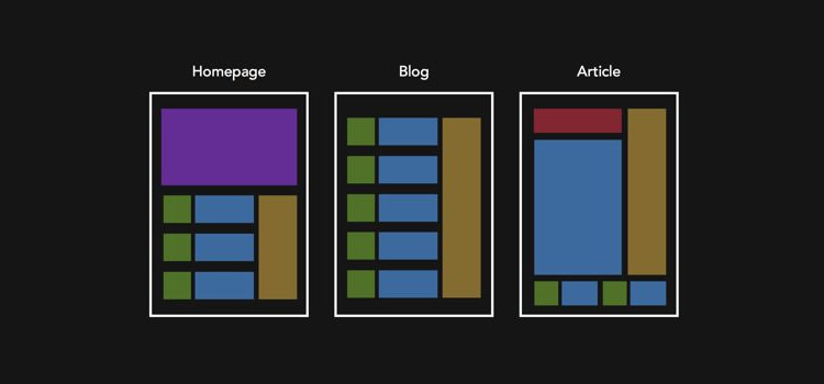
The best part of this modular dynamic design system is that it allows UI/UX designers to understand what they are creating, and the processes involved in the design and the development of interfaces. Atomic design is composed of five distinct layers:
- Atoms – the basic building blocks
- Molecules – groups of atoms, which serve as the backbone of the design systems
- Organisms – a group of molecules combined together to create a complex, distinct user interface
- Templates – a group of organisms that function together to create pages
- Pages – the last stage of the atomic design hierarchy that basically involves specific instances of templates
Have a look at this video to understand the concept of atomic website design.
How Atomic Design Can Create Better UI and Improve UX
Implementing an atomic design methodology while developing websites and mobile apps will allow designers to improve the overall UX. By keeping the smallest and most fundamental web and app components in mind. A clear and simple methodology of atomic design helps web design teams craft design systems, not pages.
According to Brad Frost,
“Atomic design gives us an ability to traverse from abstract to concrete. Because of this, we can create systems that promote consistency and scalability while simultaneously showing things in their final context. And by assembling rather than deconstructing, we’re crafting a system right out of the gate instead of cherry-picking patterns after the fact.”
https://vimeo.com/109130093
Here are some reasons why using atomic design methodology in your interface design is a sensible approach and how it can help you make a great impact in the end.
1. Create a System of Components
When you break down a system into basic and small parts. It will become easier to figure out which components of a website can be reused and how you can mix and match those components to create molecules and organisms. By duplicating and combining atoms, you can create molecules that serve as the backbone of the design systems.
2. User-Friendly Layout
With the atomic design approach in mind, you can create more intuitive layouts that are easy to code. This will make the web development process easier and allow designers to make web design tweaks if needed in the future. In addition, it makes it a lot easier for amateur developers to understand the codebase language. The code of an atomically designed website allows developers to see what atoms, molecules, and organisms are being used and what each part of the code epitomizes.
3. Fewer Components
When requirements are clearly known beforehand, it becomes quite easier for designers and developers to use atoms, molecules, and organisms that already exist. It allows designers to create new components with minor variations while keeping the design consistent and simple.
4. Keep Your Website Up-to-date
One of the major benefits of creating atomic web designs is that it makes it relatively easier to keep your website up-to-date. You can update every single atom the way you want or simply remove certain design features. The best part is, that when you change one element, the change cascades like an avalanche throughout the interface.
5. Make Your Branding Tone Consistent
Atomic design is the philosophy of combining the smallest design details in a more organized way to give birth to large elements. Those elements combine into web templates and in turn pages. Creating a website according to the atomic website design principles gives you the complete freedom to incorporate all the atoms and molecules into your brand style. This will keep your website design visually cohesive and your brand message consistent across all platforms.
You can even extrapolate basic elements from a design that is not atomic and bring them under one umbrella to create more pages. It is highly advised to develop your website atomically right from the beginning, rather than trying to incorporate an atomic web design approach to your website down the road.
6. Facilitate Prototyping
When you have accumulated a comprehensive list of atoms right before commencing the process of website design and development, it’s easier to create mock-up pages quickly. You simply need to choose and combine the required elements of the layout. Best of all, the mockup can easily be customized and refined for the final project.
7. More Consistent Code
Atomic design allows you to capitalize on predefined atoms to create your interface design. It is quite easy to see which elements are already used for different parts of the site. This serves to alleviate the chances of code duplication. Pattern Lab helps you build thoughtful and pattern-driven user interfaces with the help of atomic design principles. It is a static site generator that stitches together all the UI components, allowing you to create front-end codes for atomic design systems.
To Conclude it All
To put it in a nutshell, the atomic design is a unique and effective design and development methodology that can construct a better UI. If truth be told, this design approach deals with crafting user interface design systems, irrespective of the technology used to create them. In today’s competitive world, our custom web design company should use atomic web design principles to create practical, lively, and evolving design systems, better products, and improved UIs, which can easily be understood by their target users.

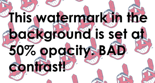
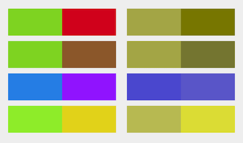
 Color blind people find great difficulty in reading text, and navigating options and experience a host of usability issues when interacting with websites. While in the throes of designing a website, nearly every designer carefully considers an array of visual elements, web design principles, the balance of shapes, the hierarchy of text, fonts, and images, and perfecting the harmony of colors. But sadly, many designers overlook the predicament of color-blind individuals and turn a blind eye to this real-life dilemma.
It is critically important to know that a large number of people are suffering from a color vision deficiency or color blindness. Not factoring in the whopping number of color blind people when designing your business website can make it difficult for them to use your website, which will negatively affect your readership and sales in the long run.
If your website incorporates some color contrast, text, and font issues, it can easily affect how customers interact with your website. To make sure that your website is highly assessable, here are some easy tips and tricks to help you create a positive web experience for color blind individuals.
Color blind people find great difficulty in reading text, and navigating options and experience a host of usability issues when interacting with websites. While in the throes of designing a website, nearly every designer carefully considers an array of visual elements, web design principles, the balance of shapes, the hierarchy of text, fonts, and images, and perfecting the harmony of colors. But sadly, many designers overlook the predicament of color-blind individuals and turn a blind eye to this real-life dilemma.
It is critically important to know that a large number of people are suffering from a color vision deficiency or color blindness. Not factoring in the whopping number of color blind people when designing your business website can make it difficult for them to use your website, which will negatively affect your readership and sales in the long run.
If your website incorporates some color contrast, text, and font issues, it can easily affect how customers interact with your website. To make sure that your website is highly assessable, here are some easy tips and tricks to help you create a positive web experience for color blind individuals.
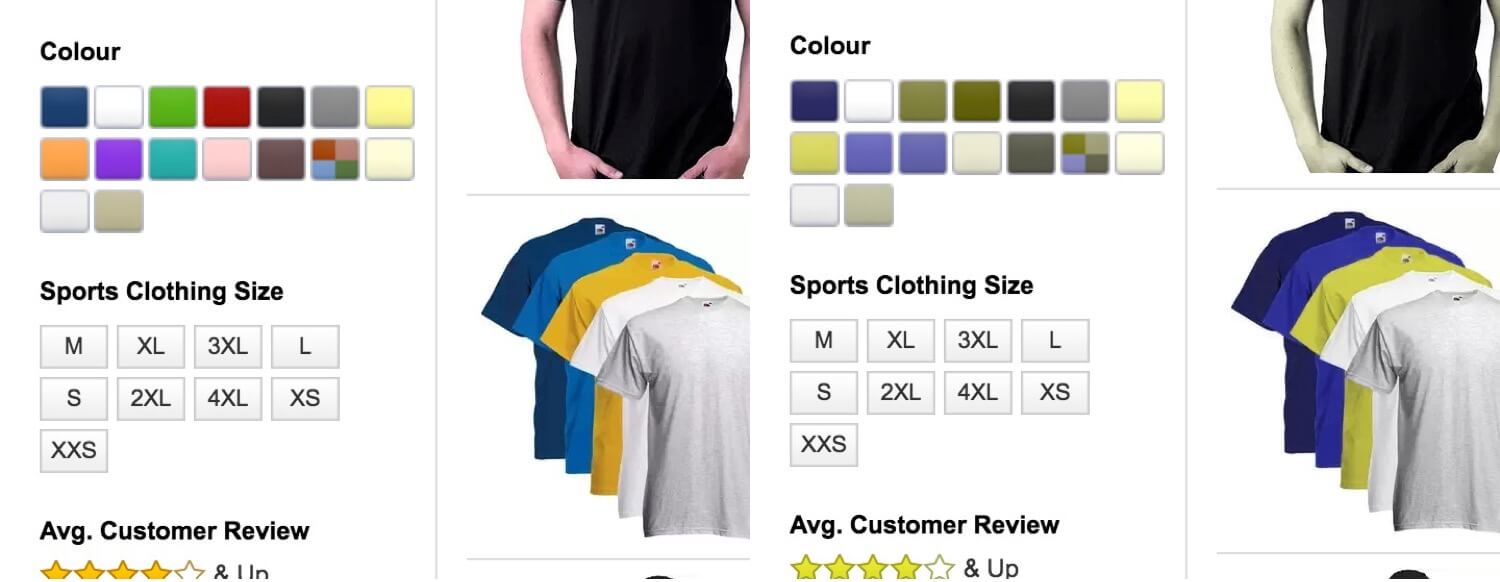
 It is quite cumbersome for color-blind individuals to ascertain the color of this classic vintage logo t-shirt from Superdry. Because they neglected to mention the color in the product description. However, Italian Grace intelligently specifies the color of this striped shirt in the title and comes across as a more sensitive brand.
 Another brand that is working for the greater good is Gap, since they keep their color-blind audience in mind and specifically add a text label beside each color.
 Amazon also made it easier to recognize the color of their products by popping up descriptive text when the user hovers over images.
 People with normal vision can also take advantage of this descriptive text. For instance, sometimes it is difficult to differentiate dark hues such as navy and black on a screen. However, adding a text label can solve the problem.

 When done right:
 Labeling your instructions clearly with the help of text is a sensible choice in order to avoid any confusion.


 The website of the UK Government Digital Service (GDS) would have someone suffering from Achromatopsia (total color blindness) scratching their heads in bamboozlement when it comes to treasure-hunting for a clickable link on the website. The only way left for them is to painstakingly hover over every possible word, holding their breath in anticipation, waiting to see if the cursor would transform into a pointer. Now imagine doing this with a mobile device! In order to ease navigation and make your website more accessible, why not incorporate icons to denote links, or even better, underline any hyperlinked text?


 Oreo always struggles hard to promote their products a bit differently. Their Wonderfilled animated campaign is an amazing example of video marketing that shows how a blood-sucking vampire takes a positive turn with the help of the classic crème-centered cookie. Through this video, Oreo wants its consumers to see the world with positivity, openness, and sincerity.
According to Janda Lukin, Director, Oreo at Mondelez International, Inc., "It starts with a very simple premise, about how something as small as an Oreo cookie can bring about a positive change in perspective. Kids already have a sense of wonder in how they see the world, but adults have to be reminded of that. The stories are going to resonate with different people, but overall, it's an adult campaign."
The beautifully animated campaign beseeches adolescents and adults to get in touch with their childlike sense of wonder, something we have gone astray from in this cut-throat era, and stop for a minute to enjoy everything around them.
While, indubitably their main objective is to make their audience relate to the fuzzy, heart-warming feelings of sharing an Oreo, the campaign captures the world through the eyes of a child, creating something endearing in turn. Each element of the campaign, such as the user-generated content, catchy videos/jingles, quirky typography, vibrant scenes, and style of animation, breathe life into the campaign.
What makes this campaign so successful is that it is really easy to relate to. Not to mention, customers all over the globe have taken to creating and sharing their own versions of wonderland, keeping the legacy alive. Even though the campaign is a new take on Oreo. It still manages to retain all the brand’s core values: fun, socialness, imagination, and humor. The cartoon campaign captures emotions and themes that traditional mediums would have failed to do.
Oreo always struggles hard to promote their products a bit differently. Their Wonderfilled animated campaign is an amazing example of video marketing that shows how a blood-sucking vampire takes a positive turn with the help of the classic crème-centered cookie. Through this video, Oreo wants its consumers to see the world with positivity, openness, and sincerity.
According to Janda Lukin, Director, Oreo at Mondelez International, Inc., "It starts with a very simple premise, about how something as small as an Oreo cookie can bring about a positive change in perspective. Kids already have a sense of wonder in how they see the world, but adults have to be reminded of that. The stories are going to resonate with different people, but overall, it's an adult campaign."
The beautifully animated campaign beseeches adolescents and adults to get in touch with their childlike sense of wonder, something we have gone astray from in this cut-throat era, and stop for a minute to enjoy everything around them.
While, indubitably their main objective is to make their audience relate to the fuzzy, heart-warming feelings of sharing an Oreo, the campaign captures the world through the eyes of a child, creating something endearing in turn. Each element of the campaign, such as the user-generated content, catchy videos/jingles, quirky typography, vibrant scenes, and style of animation, breathe life into the campaign.
What makes this campaign so successful is that it is really easy to relate to. Not to mention, customers all over the globe have taken to creating and sharing their own versions of wonderland, keeping the legacy alive. Even though the campaign is a new take on Oreo. It still manages to retain all the brand’s core values: fun, socialness, imagination, and humor. The cartoon campaign captures emotions and themes that traditional mediums would have failed to do.
 Dropbox beautifully uses animation in their ad campaign where they smartly demonstrate their product. “What is Dropbox animated video” has been viewed more than 11 million times on YouTube. Here is what makes their animated video stand out among competitors:


 Without wasting more time, let's dive into the world of UX Design & how you can design an experience that users will love to refer to their friends.
 Similarly, adding a stock list is the most efficient way to grab user’s attention


 Customer reviews:
 Or even social counts work wonders!


 Take The Deep End as an example. This web consulting and internet marketing agency used a cinemagraph on their landing page to convey their brand message and a sense of professionalism and intelligence, by portraying a man in glasses at work on his laptop, with a subtle backdrop of a bookshelf behind him. This is when you notice a subtle movement; a reflection of a moving train glinting off the window glass. This unique framing is a smart play on “the train of thought” and keeps the audience riveted!
Similarly, Weltrade’s homepage has also made a classy use of cinematography. As you hover over the models in the hero image, they subtly come to life, completing a chic, formidable setting.
Adding cinemagraphs to your landing pages is indeed a worthwhile option to coax visitors into checking out the actual contents of your website.
Take The Deep End as an example. This web consulting and internet marketing agency used a cinemagraph on their landing page to convey their brand message and a sense of professionalism and intelligence, by portraying a man in glasses at work on his laptop, with a subtle backdrop of a bookshelf behind him. This is when you notice a subtle movement; a reflection of a moving train glinting off the window glass. This unique framing is a smart play on “the train of thought” and keeps the audience riveted!
Similarly, Weltrade’s homepage has also made a classy use of cinematography. As you hover over the models in the hero image, they subtly come to life, completing a chic, formidable setting.
Adding cinemagraphs to your landing pages is indeed a worthwhile option to coax visitors into checking out the actual contents of your website.
 If you peruse through the website of Tiffany & Co., the brand has leveraged a cinemagraph on their product store page to showcase their Rubedo metal collection. The striking image of a gorgeous woman standing in the open air, with her hair whipping in the air, instantly grabs the eye. This is when your eye flits from her waves to the scintillating neckpiece she is sporting over a chic plunging neckline. The neckpiece is subtly swinging about her back, perhaps caught in a gust of wind, and keeps you hooked in its glamor.
E-commerce businesses can also leverage the power of cinematography and showcase their products with a bit of motion. Look at this
If you peruse through the website of Tiffany & Co., the brand has leveraged a cinemagraph on their product store page to showcase their Rubedo metal collection. The striking image of a gorgeous woman standing in the open air, with her hair whipping in the air, instantly grabs the eye. This is when your eye flits from her waves to the scintillating neckpiece she is sporting over a chic plunging neckline. The neckpiece is subtly swinging about her back, perhaps caught in a gust of wind, and keeps you hooked in its glamor.
E-commerce businesses can also leverage the power of cinematography and showcase their products with a bit of motion. Look at this  Cinemagraphs are also a great option for your restaurant business to showcase the details of dish preparation by using a more interactive image series. The dripping of a sauce from a succulent-looking burger, or tendrils of steam wafting off from a cup of coffee, remind users of their dining experience and whet their appetite.

 Using the right visual elements on your About page can help convince your future clients and customers about your expertise. Adding a cinemagraph of your entire team can help you earn their trust. The human mind can remember and recognize faces. Using cinemagraphs of your team along with the complete bio and their names can work best for your prospects.
You can also use moving testimonials to build customer trust and show potential customers a positive brand history. In addition, you can leverage behind-the-scenes of your workplace to flaunt your future clients how the magic happens.
Using the right visual elements on your About page can help convince your future clients and customers about your expertise. Adding a cinemagraph of your entire team can help you earn their trust. The human mind can remember and recognize faces. Using cinemagraphs of your team along with the complete bio and their names can work best for your prospects.
You can also use moving testimonials to build customer trust and show potential customers a positive brand history. In addition, you can leverage behind-the-scenes of your workplace to flaunt your future clients how the magic happens.


 Moving images such as GIFs are taking the online world by storm. An image with movement attracts more people than a static one. That’s why people are expecting to see more GIFs across their news feeds and emails. A GIF is basically made up of several images that are combined together to create a short looping visual. Not only is it interactive and absolutely riveting, but a GIF conveys information much more effectively than a single image.
 GIFs and animations play a key role in communicating ideas, concepts, and processes while making content more engaging for users. You can take advantage of this trend and grab the attention of more people with your emails, newsletters, illustrations, icons, logos, and even ads.
Also Read:
GIFs and animations play a key role in communicating ideas, concepts, and processes while making content more engaging for users. You can take advantage of this trend and grab the attention of more people with your emails, newsletters, illustrations, icons, logos, and even ads.
Also Read: 


 In this poster from


