Technology is evolving at a sky-rocketing rate and the web design industry is no exception. Every year, we see the emergence of burgeoning design elements and styles, and clairvoyants take it upon themselves to predict the web design trends rising on the horizon and projected to alter the landscape of website design.
Some elements when implemented carefully, help brands in telling their stories and explaining their business values. Other elements work to improve how content looks on different screen sizes. While it’s not necessary to include all cutting-edge web design trends that come about every once in a while, many of them have real potential to improve the user experience.
Tech advancements in the web industry make it necessary for brands to redesign constantly or be lost to oblivion. But for many marketers, CEOs, and designers, website redesign is a scary thought. To stay ahead of the game in this fierce business world, brands have to stay modern, relevant, and up-to-date.
Sometimes it is mandatory for a brand to redesign its website. Imagine if major brands such as Facebook, YouTube, Dropbox, Google, and more didn’t revamp their website design from time to time in line with the most up-to-the-minute trends, would they still be as eminent? To make your website redesign a huge success, here are a few striking and beautiful website redesign examples for your inspiration. So that you can learn from their successes.
Let’s get into them!
Dropbox

To make Dropbox even better and user-friendly, they have updated their website design and put in a few functional tweaks for the ease of users, such as a simple navigational switch between linked accounts. A grid view to browse files, the addition of a homepage, allowing users to view their team members, and the addition of checkboxes that permit users to take action on files.
Twitch

Twitch is a live-streaming video platform that has recently undergone a website overhaul to enhance navigation, to focus on the video stream. The shaded video section lends even more focus and hierarchy that goes to create an amazing visual effect against the header banner imagery in the backdrop.
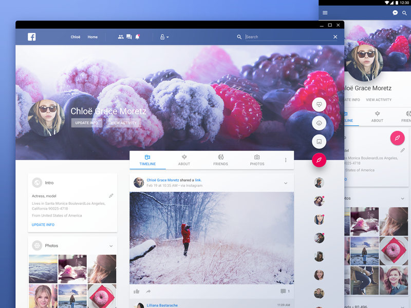
The wildly popular social media platform has undergone many website remodels. But this time they went a bit further and threw in bucketloads of features, ads, and pages to their layout. The redesign is mainly focused on the visual language, with added modifications and spacing permeated throughout. The outcome is a remarkable interface that obscures much of the extended functionality and is easier to understand, even for average users.
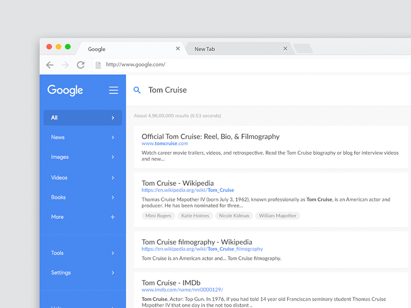
The awesome redesign of this search engine giant is immensely impressive due to the proliferate use of Material guidelines. Instead of going off on a tangent, the team of designers has brought it in line with many of the brand’s other web products, such as Google Drive, Docs, and Keep. The use of their signature blue color is a clean addition that gives the design a clutter-free look.
Trello

This renowned web-based project management application has come up with a user-friendly and simple user interface design and styling. The updated version of their website leverages depth-styling, muted colors, and different design cues from Material Design. The outcome is a perfect embodiment of a visually attractive design, offering improved contrast, clear call-to-action elements, and more spacing peppered throughout the design.
Volkswagen

This website redesign is a perfect embodiment that makes use of striking typography and diligently selected graphical images to enhance the design. The newly-formed structure offers a great deal of visual interest while adding a number of key components such as matching input and other important specifications such as pricing and more.
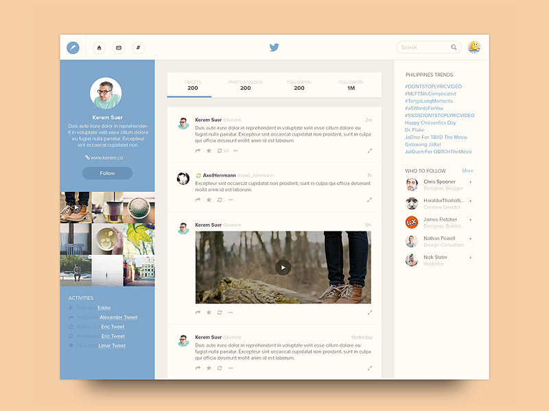
Twitter has refreshed its look and feel to make it feel lighter, faster, and easier on the eye. They have taken an entirely new approach to fix the flaws inherent in their design.
They have amalgamated profiles, additional accounts, and settings all under one umbrella. The side navigation menu and some tabs at the bottom make it easier for users to peruse through their site. They have refined the typography, with the addition of more bolder and vibrant headings to make it easier for users to see what’s happening. The use of more intuitive icons makes the tweets more engaging and lends the design a clutter-free look.
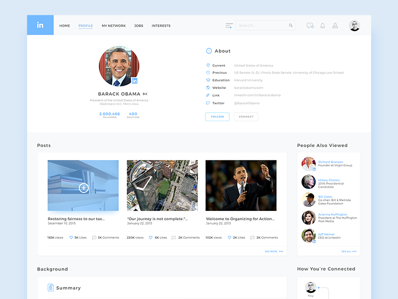
The new layout of LinkedIn is all about a more comprehensive visual hierarchy. The simplification of LinkedIn is well-structured and spacious. The use of large visuals, including profile pictures, creates a more enticing and inspiring design.
YouTube
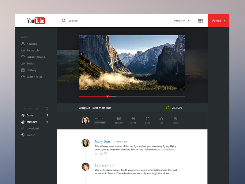
YouTube’s fresh look puts video content and creators that you love most at the front and center with a clean and simple design. The layout is built on a faster framework and the new dark theme cuts down the glare and allows the true colors of the videos that users are watching to bask in the limelight. The layout is being updated to bring it head and shoulder with the Material Design aesthetics.
IMDB
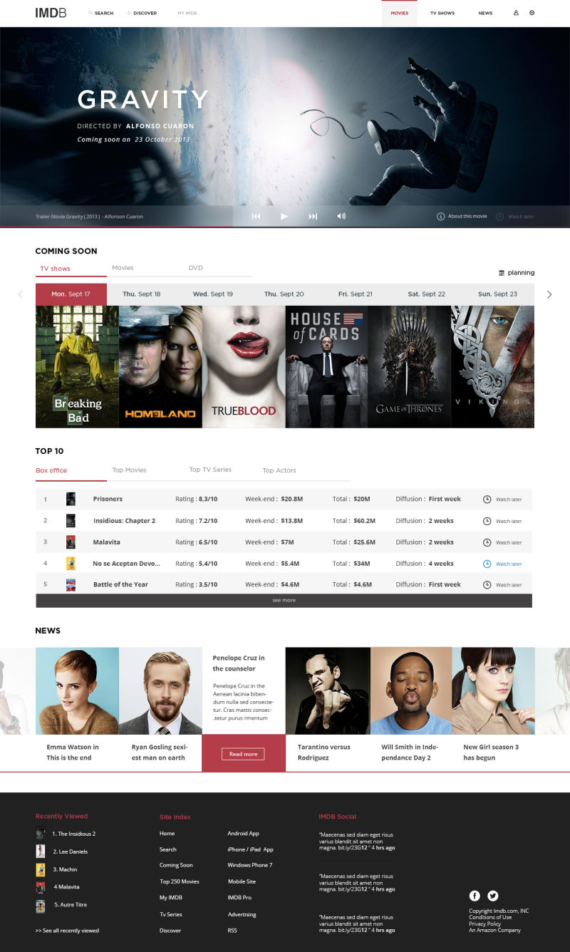
IMBD is one of the most popular and authoritative sites for movies, TV, and celebrity content. They have refurbished their look and the results are pretty awesome. They updated their homepage to bring all the information above the fold line so that users can easily find the latest trailers, top ten, news, and shows on air.
The new, intuitive search feature gives instant results. The new Discover feature opens up valuable information and interactions in a bare amount of time. In addition, the Detailed Sheet gives you media-related news, reviews, and recommendations.
Over to You
Website redesign is not an easy feat. In fact, it is a pretty big investment. While redesigning your website, you need to keep the latest web design trends, user experience, and site functionality in mind. To give your website a fresh look, consider the above-cited brand examples and make your website redesign process a huge success!
 Read More Blogs