


When I was a kid, the Internet felt like magic.
I’d spend hours in front of a computer my uncle had introduced me to, completely blown away that there was this thing called the “World Wide Web.” I couldn’t believe I could connect through a server to explore a whole other world hosted halfway across the globe in the United States.
Fast forward to today, and we’ve got smartphones that are literally 50 times more powerful than those old computers we played on as teens. The world has gone full mobile.
It all really kicked off when Apple released the first iPhone in 2007. I remember late nights at cafes with my nerdy best friends, talking about the latest Harry Potter books or getting lost in Lord of the Rings, while plotting crazy strategies for Dungeons & Dragons. Back then, no one really thought a tiny device could change the way we live, surf the internet, or interact with each other. Things started to click around 2012 when Android phones started popping up, giving us more choices and opening the door to a whole new mobile world. Now, almost everyone has a smartphone, and the mobile industry has exploded.
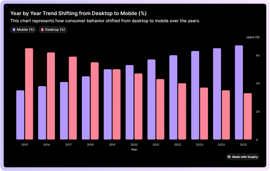
This growth is insane, it’s powerful. More than half of all internet traffic now comes from mobile devices, like phones and tablets. So, it’s no surprise that mobile-first CSS is more important than ever. Mobile apps have even become huge money-makers. Take Activision Blizzard, for example—their mobile division alone makes more money than all their other products combined, including World of Warcraft. And yes, a big part of that success comes down to one tiny, addictive game: Candy Crush.
If you’re not thinking mobile-first when it comes to your CSS, you’re basically leaving money (and users) on the table. But don’t worry, we’re not about to let you miss out.
In this article, we’re going to break down what mobile-first CSS is, why it matters, and why investing in it can give your business the edge it needs to rise to the top.
What is Mobile-First CSS?
Mobile-first CSS is a design philosophy. It’s the idea that your mobile experience should be front and center in your product development. It prioritizes your brand for the mobile market.
From a technological perspective, mobile-first CSS means we write the interface and style it so that smartphones and other small devices can process information better than desktops.
It’s like writing the code specifically for mobile.

You see, the desktop experience is quite different from mobile. Mobility mostly depends on taps and scrolls, which is very different from interacting with a desktop using a mouse and keyboard. On a desktop, you often have a consistent connection with stable speed and an unmetered plan. On mobile, however, you’re often transmitting data over metered connections that can come with extra charges. Data efficiency is extremely important, which changes how designs need to be approached.
Similarly, phone signals can drop in low-coverage areas, which means data-heavy web pages might fail to perform or load correctly. This requires a more sophisticated approach to coding.
It shows Mobile-first CSS takes plenty of variables into account making the app experience better.
Why is Mobile Experience Different from Desktop?
You see, mobile experiences are way different from desktop experiences for a bunch of reasons.
Let’s break them down, which will help explain why mobile-first CSS is so important.
Screen Size & Resolution: Almost all mobile devices have smaller screens compared to laptops or desktops, which means content needs to be stacked accordingly. Because mobile screens are vertical, information is arranged top to bottom, including elements like buttons and links, which need to be bigger for touch. Desktops, on the other hand, have plenty of space, so content can be spread out more evenly.
Input Method: The way people interact with mobile is very different from desktops. On mobile, you tap and swipe with your fingers, not click with a mouse or type on a keyboard. That means mobile requires larger touch targets, more generous spacing, and intuitive gestures. Desktops don’t use touch as much—they rely heavily on mouse precision and keyboard input.
Performance & Connectivity: Mobile users often access the internet through their telecom services, which are usually slower and rely on metered connections (3G/4G/5G, etc.). This means that when people interact with your website or solution, they expect fast loading times, optimized images, and minimal coding. Desktops usually run on high-speed connections, so layout is less of a concern.
Context of Use: People often use different mobile devices and log into multiple mobile sessions, which are usually short, fragmented, and on-the-go. Desktop sessions, on the other hand, tend to be longer and more focused, which affects how content is represented to that specific demographic. On mobile, the content is presented in ways which appeal to users in the form of short bursts of attention.
How Do You Proceed with Mobile-First CSS Approach?
Think of Mobile-First CSS like packing a backpack before going on a hike. You start with the absolute essentials like water, snacks, and maps, basically the stuff you can’t do without. Once that’s ready, you think about extras like a camera or a sweater. Mobile-first CSS works the same way.
Your mindset shift is: You design a website starting with the smallest screen first.

Next, you make sure the core content and features actually work. Once that’s solid, you add enhancements for bigger screens such as fancier layouts, bigger images, and extra buttons. This way, no matter what device someone is on, they get a smooth, fast, and usable experience.
Basically, you are designing a website that grows gracefully as it scales rather than trying to squeeze a huge desktop site onto a tiny phone screen.
The Benefits of Mobile-First CSS
Mobile-first CSS comes with a bunch of benefits, including improved website performance, better SEO, and an overall superior user experience.
These websites are also easier to maintain and ready for a wide range of devices. As mentioned earlier, you start designing for small screens and gradually add elements for larger ones.
This approach helps create leaner code and reach a wider audience.
Here are some key benefits of implementing mobile-first CSS:
Well-Optimized User Experience (UX) – It gives you a clean, uncluttered layout so developers can build navigation that is user-friendly and touch-friendly, reducing frustration for visitors.
Improved Site Speed and Performance – Starting lean means faster page load times, which is crucial for mobile users on slow connections.
Better SEO and Higher Search Rankings – Google favors mobile-friendly websites, helping them load faster, reduce bounce rates, and gain better visibility overall.
Essential Content First – Developers focus on the most important content and functionality first, making the website more focused and effective.
Easier Site Maintenance and Scalability – Cleaner, more modular code is easier to debug, maintain, and adapt for new devices.
Progressive Enhancement – Mobile-first CSS ensures a strong core experience for everyone while adding extra features and enhancements for more capable devices.
Also Read: How to Improve Core Web Vitals of Your Website?
Common Mistakes People Make With Mobile-First CSS
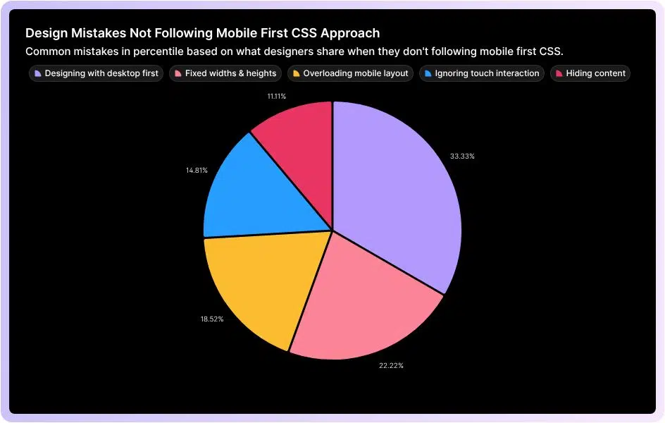
A lot of people try to “go mobile-first” but end up doing the exact opposite without even realizing it.
Here are some of the most common slip-ups that quietly ruin the whole point of mobile-first CSS.
Designing With Desktop in Mind First
One of the biggest mistakes? Starting with a complex desktop layout and then trying to shrink it for mobile. Spoiler: it rarely works. Start with the smallest screen first. Focus on the basics. Once that’s solid, slowly tweak things for bigger screens using CSS media queries (min-width).
Using Fixed Widths & Heights
Lots of developers stick to fixed units like px for widths, margins, or fonts. It seems safe… until the layout breaks on a different screen. Instead, go with responsive units like em, rem, %, vw, or vh. These let your design flow naturally across devices.
Overloading the Mobile Layout
Ever seen a mobile site that feels like a messy mess? Yeah, that’s usually because someone tried to cram every desktop element onto a tiny screen. The fix? Prioritize content. Start with the essentials for mobile. Secondary info? Hide it in collapsible sections or tabs. Keep it clean.
Ignoring Touch Interaction
Here’s a fun fact: mobile users don’t click, they tap and swipe. Desktop-first devs sometimes forget this. Buttons and links? Make them big enough to tap without frustration. Google suggests around 48×48 CSS pixels, with enough spacing so thumbs don’t collide.
Hiding Content
Hiding stuff with display: none to “clean up” mobile views? Users hate that. Instead, rearrange thoughtfully. Vertical stacking, simplified menus, or breaking content into chunks works way better than just disappearing info.
Tools & Framework That Supports Mobile-First Development

Here’s the thing with mobile-first development: it relies on tools and frameworks that are built to prioritize small screens first. Take Tailwind CSS, for example, it’s a utility-first CSS framework that makes it easy to create responsive designs by starting with mobile styles and then adding enhancements for larger screens. Bootstrap works in a similar way, offering a grid system and prebuilt components that are designed to scale naturally from phones to desktops. Beyond CSS, cross-platform tools like Flutter, React Native, and Ionic let developers build mobile apps that adapt seamlessly across devices while keeping performance optimized for small screens. On the testing and responsiveness side, tools like Chrome DevTools and Responsively App let you preview and tweak how your designs behave on different screen sizes in real time, making sure your mobile-first approach works fine.
How Mobile-First Approach Impacts Conversion Rates
Mobile-first boosts conversion rates because it forces your entire front-end architecture to become lighter and more user-friendly on the devices which most individuals use.
When you build mobile-first, your base CSS is minimal.
Smaller CSS Payload Equates to Faster First Paint
When you build mobile-first, your base CSS is minimal. Desktops only get extra styles through min-width queries. It leads to:
- Mobile devices download less CSS
- The browser parses styles faster
- Layout and paint happen sooner
A faster first paint directly reduces bounce rates, especially on mid-range smartphones.
Also Read: 6 Tips to Improve Google Pagespeed Insight Score.
- Optimized Rendering Path
Mobile-first encourages developers to load only essential content first. It further improves the Critical Rendering Path by reducing:
- Render-blocking resources
- Unnecessary JavaScript
- DOM complexity
With fewer steps between request → render, your page becomes visibly usable much quicker, which increases user retention.
- Smaller, Responsive Images Reduce Latency
Part of mobile-first is using responsive images (srcset, sizes) and optimized formats (WebP/AVIF).
Mobile browsers automatically choose the smallest appropriate file.
Less data means faster load time and a higher chance to keep user long enough so they convert.
- Better Interaction Through Touch-Optimized UI
Technical adjustments like:
- Larger hit areas (44px+)
- Adequate spacing
- Avoiding hover-only interactions
- Using touch-action for smoother gestures
These reduce interaction friction. When actions are easy to complete, conversions naturally rise.
- Improved Core Web Vitals
Mobile-first directly impacts CWV, which affect both SEO and conversion rates:
- LCP (Largest Contentful Paint): Mobile-first reduces asset sizes, improving load times.
- FID/INP (Input Delay): Less JavaScript and simpler layouts mean faster interaction.
- CLS (Layout Shift): Mobile-first usually uses more predictable layouts, reducing shift issues.
Because better web vitals mean better rankings and overall increase online traffic.
It also brings higher conversions.
- Reduced Network Strain on Mobile Data
Mobile-first development accounts for:
- High latency
- Metered data plans
- Weak signals
It trims the code and prioritizes essential content. Your site eventually stays functional even on weak 3G-like connections. This stability translates into a user completing a checkout or sign-up.
- Progressive Enhancement Encourages Completion
Mobile-first is essentially progressive enhancement:
- Core functionality loads fast
- Extra features load later
- The user can complete primary tasks even if scripts fail or the network drops
It ultimately keeps the conversion path stable, even in imperfect real-world conditions.
Practical Tips to Designing a Mobile-First CSS Layout
Start with the smallest screen first mindset:
Design for a narrow viewport (like 320–375px) before thinking about anything bigger. It keeps you on your toes to only design what truly matters on the page.
Keep your layout single-column by default:
Mobile-first usually means stacking elements vertically. A clean single-column layout keeps content readable and easy to scan.
Always use min-width media queries:
Write your default CSS for mobile, then add enhancements using @media (min-width: …). As a result, your CSS becomes more lead and doesn’t experience any overrides.
You can optimize images and media early:
Use responsive images (srcset, sizes), compression, and modern formats (WebP/AVIF). Because, heavy images are the #1 reason mobile users bounce.
You can increase touch targets and spacing:
Buttons and interactive elements should generally be 44px or larger. You should give everything room, fingers need space, they don’t need pixel-perfect precision.
You should use fluid and flexible units:
Use em, rem, %, and vw instead of fixed pixels where possible. It will ultimately make your design scale naturally across different screen sizes.
You may limit the amount of JavaScript above the fold:
If you have too much JS blocks rendering, keep what’s needed, defer the rest and let the layout load instantly.
Prioritize content hierarchy:
Show the most relevant and important content first, because mobile users scroll fast. They need context immediately.
Test your app in real mobile conditions:
Use throttling in Chrome DevTools by testing your app on mid-range phones and simulating slow networks. Because, real world performance matters more than scoring perfect lab scores.
Final Word
Designing with a mobile-first CSS approach isn’t just a technical choice, it has rather become a necessity.
It’s an approach that ensures your users have a usable experience no matter the type of device which they are using. It directly impacts site engagement, increases conversion and achieves success.
Following a mobile-first CSS approach means you’re focusing on essentials first.
You’re basically optimizing your website for touch and progressively enhancing layouts for bigger screens. You’re not only building websites or apps, you’re designing digital experiences which people enjoy and trust. Mobile-first CSS is your way of keeping pace with how the world actually interacts with the web. Ignore it, and you simply risk frustrating users and losing potential opportunities.
The only way in a pixel-perfect world is to embrace it; this way, you’re setting your product up to thrive in a mobile-first world, just like the internet we once explored with wonder as kids.
 Read More Blogs